Documentation v1.0.0
Koviera
Multi-Purpose Ecommerce HTML Template. Everything you need to edit the pages, re-theme them, and put them online.
- 10 storefronts
- 80 pages
- 45 components
- 33 sections
- 273 design tokens
Introduction
Koviera is a multi-purpose ecommerce HTML template. Ten storefronts — fashion, furniture, electronics, perfume & beauty, shoes, bags, watches, organic groceries, jewellery and toys — share one design system: the same components, the same product card, one stylesheet.
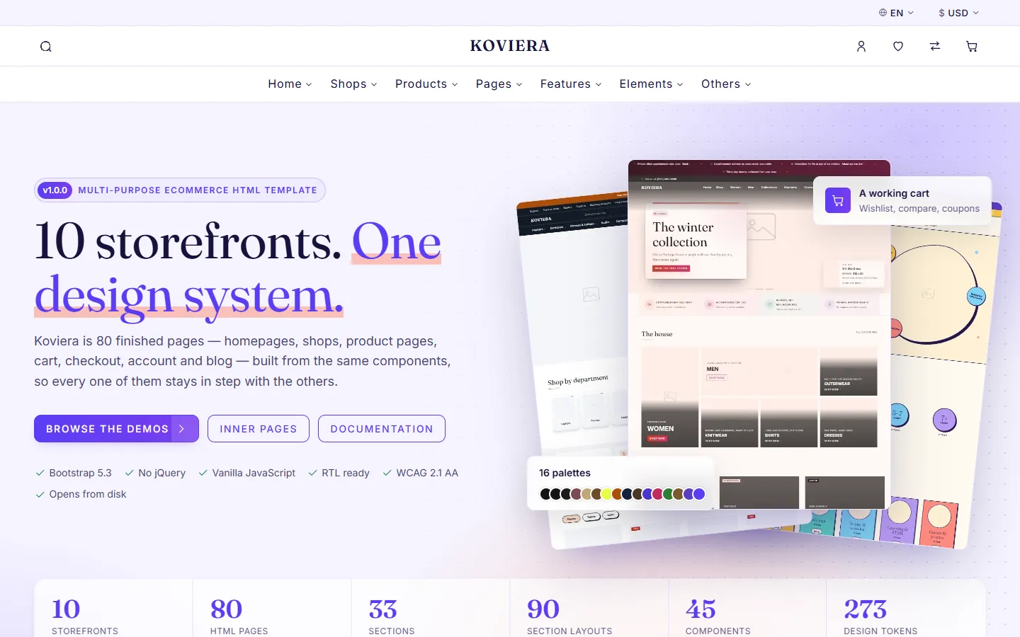
Everything in html/ is finished, indented, hand-editable HTML. Open a page, change the words and the images, and upload the folder. There is no build step and nothing to install.
What is in the download
| Folder or file | What it holds |
|---|---|
html/ | The 80 finished pages, plus css, js, images and fonts |
documentation/ | This manual |
licenses/ | Licence text for Bootstrap, Popper, Swiper, GLightbox and Uiverse |
tools/ | The optional minifier behind npm run build |
SETUP.txt | The first five minutes: run it, colours, logo, images, forms |
CREDITS.md | Every third-party asset and its licence |
CHANGELOG.md | What changed in each version |
Three pages worth opening first
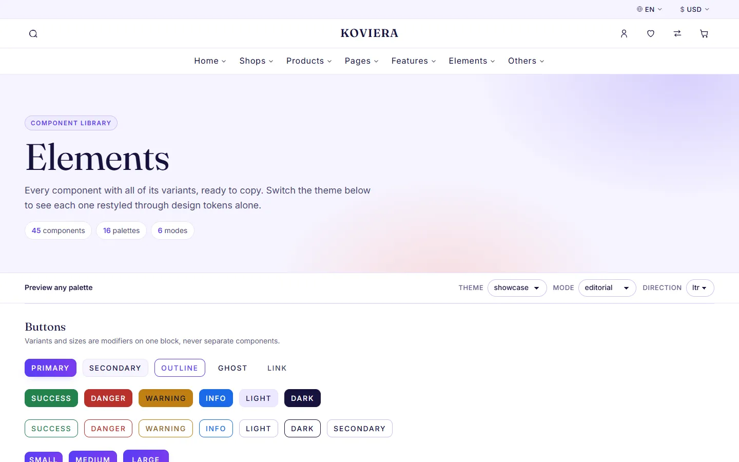
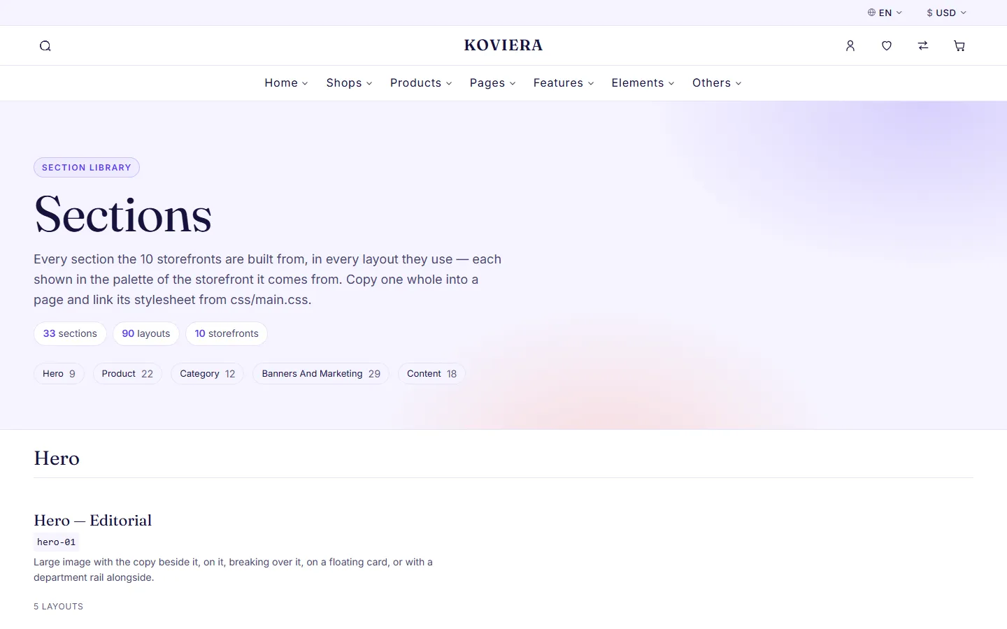
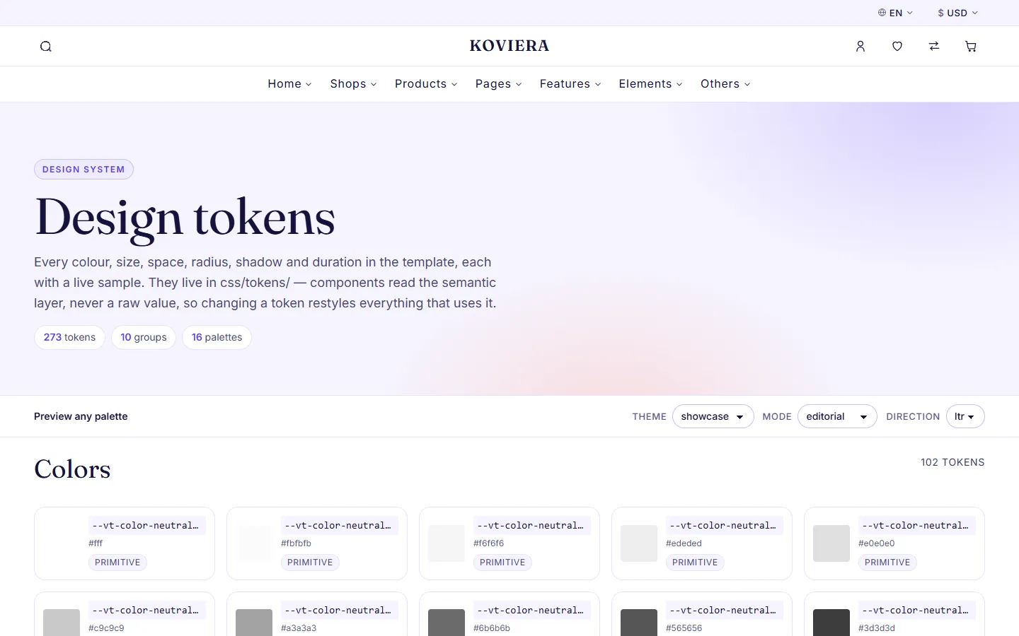
html/elements.html— every component and variant, ready to copyhtml/sections.html— every section and configuration, rendered livehtml/tokens.html— every design token with a live sample
Browser support
The latest two versions of Chrome, Edge, Firefox and Safari; Safari and iOS Safari 16.4 and newer; Chrome for Android. The stylesheets use color-mix(), :has() and container queries, which older browsers do not understand.
Getting started
Previewing the pages
Every page is standalone and every path is relative, so html/ works from any location. Double-click a page and it opens straight from disk, with the cart, the sliders and every drawer working — no server, no network.
If you prefer a local server while you work, any static server will do:
npx serve html
python -m http.server 8080 --directory html
To publish, upload the contents of html/ to your host.
Editing a page
Open the page in your editor and change it. Copy a component from html/elements.html or a whole section from html/sections.html and paste it where you want it. Each page links only the stylesheets and scripts it uses, so if the page does not link the component's files yet, copy them too: its <link> from elements.html or sections.html into the page's <!-- koviera:css --> block, keeping the order of html/css/main.css, and its <script> into the page's <!-- koviera:js --> block — see "JavaScript", "Adding a component to a page".
Where things live
| I want to change | Edit |
|---|---|
| Colours, type, spacing | html/css/tokens/ — see "Design tokens" |
| A storefront's palette | html/css/themes/<name>.css, named by data-vt-theme on <html> |
| A component's look | html/css/components/<name>.css |
| A component's behaviour | html/js/components/<name>.js |
| The logo | .vt-logo in the header and footer of each page |
| Products, prices, words | The page itself — everything is in the HTML |
| Images | html/assets/images/, then the <img> tags |
| Currency | window.VT_CONFIG — see "JavaScript" |
Folder structure
html/                     the template — upload this folder
  index.html              preview landing: every demo and page
  home-*.html             ten storefront homepages
  shop*.html              five shop layouts, plus one shop per storefront
  product-*.html          three product layouts, plus one per storefront
  cart*.html, checkout*.html, order-*.html
  account*.html, login.html, register.html, forgot-password.html
  blog*.html, about.html, contact.html, faq.html, ... the content pages
  elements.html           every component and variant
  sections.html           every section and configuration
  tokens.html             every design token
  robots.txt              edit before you go live
  css/
    main.css              the order of every stylesheet below
    tokens/               design tokens: colours, type, spacing, radius...
    base/                 reset, fonts, typography, links, forms, buttons
    vendor/               class hooks for Swiper
    layout/               grid, section
    components/           one file per component
    sections/             one file per section family
    pages/                page-specific layout
    modes/                type, shape and rhythm; every page uses editorial,
                          the others are ready to swap in
    themes/               one file per colour palette
    utilities/            vt-u-* helpers
    libs/                 GLightbox's stylesheet
  js/
    core/                 app start-up, component registry, DOM helpers
    adapters/             the data source: cart, wishlist, compare
    components/           one file per interactive component
    ecommerce/            cart page, checkout, filters, saved lists
    libs/                 Bootstrap (with Popper), Swiper, GLightbox
  dist/                   minified copies — see "Minified build"
  assets/
    css/                  Bootstrap, left-to-right and right-to-left
    fonts/                Inter and Fraunces, with their licences
    images/               placeholder, brand marks, demo thumbnails
    favicon.svg
documentation/            this manual
licenses/                 licence text of every bundled library
tools/                    the minifier behind npm run build
package.json              only for npm run build
What a page loads
Each page links only the stylesheets whose rules can apply to it — its own palette, its own sections, the components it uses — between <!-- koviera:css --> and <!-- /koviera:css -->. A shop or content page loads under sixty of the 145, a storefront homepage around seventy; sections.html, which shows everything, loads the most. To use a component or section on a page that does not have it yet, add its stylesheet to that page's block, in the order css/main.css gives.
Scripts work the same way. Every page loads the core — the component registry, the cart, wishlist and compare, the header's helpers — plus the file of each component it uses, in dependency order, between <!-- koviera:js --> and <!-- /koviera:js -->. Swiper and GLightbox load only on the pages that use them.
The rule that keeps it navigable
A component owns its markup, its styles and its behaviour, and they are named the same in all three places:
class="vt-product-card"        the markup, in the pages
css/components/product-card.css
js/components/carousel.js      data-vt-component="carousel"
Class names follow one pattern: vt- namespace, then BEM — .vt-product-card__title, .vt-product-card--overlay. Utilities are .vt-u-*.
Design tokens
273 tokens, declared in html/css/tokens/ — one file per group, the same groups as below. html/tokens.html shows each one with a live sample.
Tokens come in two layers. Primitive tokens are raw values. Semantic tokens are what components reference. Change a semantic token and every component follows; change a primitive and you change the palette everywhere it is used.
To re-theme, override semantic tokens only, in a theme file of your own (html/css/themes/mine.css, linked from the page) named on the page's <html data-vt-theme="mine">:
[data-vt-theme="mine"] {
  --vt-c-primary: #1c1a17;
  --vt-c-bg: #faf7f0;
  --vt-font-heading: var(--vt-font-serif);
}
Any token that carries text must reach 4.5:1 contrast against both --vt-c-bg and --vt-c-bg-soft. Every palette that ships meets it.
colors
| Token | Value | Layer |
|---|---|---|
--vt-color-neutral-0 | #fff | primitive |
--vt-color-neutral-25 | #fbfbfb | primitive |
--vt-color-neutral-50 | #f6f6f6 | primitive |
--vt-color-neutral-100 | #ededed | primitive |
--vt-color-neutral-200 | #e0e0e0 | primitive |
--vt-color-neutral-300 | #c9c9c9 | primitive |
--vt-color-neutral-400 | #a3a3a3 | primitive |
--vt-color-neutral-500 | #6b6b6b | primitive |
--vt-color-neutral-600 | #565656 | primitive |
--vt-color-neutral-700 | #3d3d3d | primitive |
--vt-color-neutral-800 | #262626 | primitive |
--vt-color-neutral-900 | #141414 | primitive |
--vt-color-neutral-950 | #0a0a0a | primitive |
--vt-color-brand-500 | #141414 | primitive |
--vt-color-brand-600 | #000 | primitive |
--vt-color-red-500 | #b8302c | primitive |
--vt-color-red-600 | #9c2723 | primitive |
--vt-color-green-500 | #23824e | primitive |
--vt-color-amber-500 | #c07f14 | primitive |
--vt-color-blue-500 | #1a6be8 | primitive |
--vt-color-orange-100 | #fff1e3 | primitive |
--vt-color-orange-300 | #f9c893 | primitive |
--vt-color-orange-500 | #e2681b | primitive |
--vt-color-orange-600 | #c4560f | primitive |
--vt-color-orange-700 | #a8480c | primitive |
--vt-c-primary | var(--vt-color-brand-500) | semantic |
--vt-c-primary-hover | var(--vt-color-brand-600) | semantic |
--vt-c-on-primary | var(--vt-color-neutral-0) | semantic |
--vt-c-secondary | var(--vt-color-neutral-600) | semantic |
--vt-c-accent | var(--vt-color-brand-600) | semantic |
--vt-c-on-accent | var(--vt-color-neutral-0) | semantic |
--vt-c-accent-hover | color-mix( in srgb, var(--vt-c-accent-ink) 86%, var(--vt-c-heading) ) | semantic |
--vt-c-accent-ink | color-mix(in srgb, var(--vt-c-accent) 55%, var(--vt-c-heading)) | semantic |
--vt-c-text | var(--vt-color-neutral-700) | semantic |
--vt-c-heading | var(--vt-color-neutral-900) | semantic |
--vt-c-muted | var(--vt-color-neutral-500) | semantic |
--vt-c-text-inverse | var(--vt-color-neutral-300) | semantic |
--vt-c-heading-inverse | var(--vt-color-neutral-0) | semantic |
--vt-c-border | var(--vt-color-neutral-200) | semantic |
--vt-c-border-strong | var(--vt-color-neutral-400) | semantic |
--vt-c-border-inverse | rgb(255 255 255 / 0.16) | semantic |
--vt-c-heading-page | var(--vt-c-heading) | semantic |
--vt-c-text-page | var(--vt-c-text) | semantic |
--vt-c-muted-page | var(--vt-c-muted) | semantic |
--vt-c-secondary-page | var(--vt-c-secondary) | semantic |
--vt-c-border-page | var(--vt-c-border) | semantic |
--vt-c-border-strong-page | var(--vt-c-border-strong) | semantic |
--vt-c-link-hover-page | var(--vt-c-link-hover) | semantic |
--vt-c-link-underline-page | var(--vt-c-link-underline) | semantic |
--vt-c-nav-hover-page | var(--vt-c-nav-hover) | semantic |
--vt-c-bg-page | var(--vt-c-bg) | semantic |
--vt-c-bg-soft-page | var(--vt-c-bg-soft) | semantic |
--vt-c-bg-muted-page | var(--vt-c-bg-muted) | semantic |
--vt-c-price-page | var(--vt-c-price) | semantic |
--vt-c-price-old-page | var(--vt-c-price-old) | semantic |
--vt-c-sale-page | var(--vt-c-sale) | semantic |
--vt-c-primary-page | var(--vt-c-primary) | semantic |
--vt-c-accent-ink-page | var(--vt-c-accent-ink) | semantic |
--vt-brand-logo-filter-page | var(--vt-brand-logo-filter) | role |
--vt-c-bg | var(--vt-color-neutral-0) | semantic |
--vt-c-bg-soft | var(--vt-color-neutral-50) | semantic |
--vt-c-bg-muted | var(--vt-color-neutral-100) | semantic |
--vt-c-bg-inverse | var(--vt-color-neutral-950) | semantic |
--vt-c-overlay | rgb(10 10 10 / 0.5) | semantic |
--vt-c-primary-fill | none | semantic |
--vt-c-primary-fill-deep | none | semantic |
--vt-c-glow | transparent | semantic |
--vt-c-wash | none | semantic |
--vt-c-wash-inverse | none | semantic |
--vt-c-nav-hover | var(--vt-c-heading) | semantic |
--vt-c-link | currentcolor | semantic |
--vt-c-link-hover | var(--vt-color-neutral-900) | semantic |
--vt-c-link-underline | var(--vt-color-neutral-300) | semantic |
--vt-c-success | var(--vt-color-green-500) | semantic |
--vt-c-success-ink | color-mix(in srgb, var(--vt-c-success) 72%, var(--vt-c-heading)) | semantic |
--vt-c-success-surface | var(--vt-c-success) | semantic |
--vt-c-warning | var(--vt-color-amber-500) | semantic |
--vt-c-danger | var(--vt-color-red-500) | semantic |
--vt-c-info | var(--vt-color-blue-500) | semantic |
--vt-c-sale | var(--vt-color-red-500) | semantic |
--vt-c-sale-base | var(--vt-c-sale) | semantic |
--vt-c-sale-surface | var(--vt-c-sale) | semantic |
--vt-c-price | var(--vt-color-neutral-900) | semantic |
--vt-c-price-old | var(--vt-color-neutral-500) | semantic |
--vt-c-rating | var(--vt-color-amber-500) | semantic |
--vt-c-focus | var(--vt-color-orange-500) | semantic |
--vt-c-field-accent | var(--vt-color-orange-500) | semantic |
--vt-c-sale-band | #6d1618 | semantic |
--vt-c-field-tint | color-mix(in srgb, var(--vt-c-field-accent) 12%, var(--vt-c-bg)) | semantic |
--vt-brand-logo-filter | brightness(0.4) | role |
--vt-brand-logo-filter-inverse | brightness(2.6) | role |
--vt-c-check | var(--vt-c-primary) | semantic |
--vt-gradient-check | linear-gradient(135deg, #7a3408 0%, #c4560f 46%, #e2681b 100%) | role |
--vt-c-check-surface | linear-gradient(var(--vt-c-check), var(--vt-c-check)) | semantic |
--vt-c-check-surface-deep | var(--vt-gradient-check-deep) | semantic |
--vt-gradient-check-deep | linear-gradient( 135deg, #5c2606 0%, #8a3a09 46%, var(--vt-color-orange-700) 100% ) | role |
--vt-radio-dot | radial-gradient( circle closest-side, color-mix(in srgb, var(--vt-c-check) 78%, #fff) 0%, var(--vt-c-check) 50%, var(--vt-c-check) 56%, color-mix(in srgb, var(--vt-c-check) 22%, transparent) 72%, transparent 100% ) | role |
--vt-scrim-block | linear-gradient( to top, rgb(0 0 0 / 0.88) 0%, rgb(0 0 0 / 0.68) 38%, rgb(0 0 0 / 0.1) 100% ) | role |
--vt-scrim-block-full | linear-gradient( to top, rgb(0 0 0 / 0.72) 0%, rgb(0 0 0 / 0.6) 100% ) | role |
--vt-scrim-block-edge | linear-gradient( var(--vt-scrim-angle, calc(90deg * var(--vt-scrim-dir, 1))), rgb(0 0 0 / 0.7) 0%, rgb(0 0 0 / 0.7) calc(100% - var(--vt-scrim-fade, 3rem)), rgb(0 0 0 / 0.42) calc(100% - var(--vt-scrim-fade, 3rem) / 2), rgb(0 0 0 / 0) 100% ) | role |
--vt-scrim-block-down | linear-gradient( to bottom, rgb(0 0 0 / 0.72) 0%, rgb(0 0 0 / 0.62) 45%, rgb(0 0 0 / 0.05) 100% ) | role |
--vt-scrim-inline | linear-gradient( to right, rgb(0 0 0 / 0.72) 0%, rgb(0 0 0 / 0.6) 45%, rgb(0 0 0 / 0.12) 100% ) | role |
typography
| Token | Value | Layer |
|---|---|---|
--vt-font-sans | "Inter", "Inter Fallback", system-ui, -apple-system, "Segoe UI", roboto, helvetica, arial, sans-serif | role |
--vt-font-serif | "Fraunces", "Fraunces Fallback", georgia, "Times New Roman", times, serif | role |
--vt-font-mono | ui-monospace, sfmono-regular, menlo, consolas, monospace | role |
--vt-font-body | var(--vt-font-sans) | role |
--vt-font-heading | var(--vt-font-sans) | role |
--vt-font-display | var(--vt-font-heading) | role |
--vt-font-nav | var(--vt-font-body) | role |
--vt-font-button | var(--vt-font-body) | role |
--vt-font-price | var(--vt-font-body) | role |
--vt-text-2xs | 0.75rem | role |
--vt-text-xs | 0.8125rem | role |
--vt-text-sm | 0.875rem | role |
--vt-text-base | 1rem | role |
--vt-text-md | 1.0625rem | role |
--vt-text-lg | clamp(1.0625rem, 1.02rem + 0.2vw, 1.125rem) | role |
--vt-text-xl | clamp(1.1875rem, 1.1rem + 0.4vw, 1.375rem) | role |
--vt-text-2xl | clamp(1.375rem, 1.24rem + 0.68vw, 1.75rem) | role |
--vt-text-3xl | clamp(1.625rem, 1.4rem + 1.12vw, 2.25rem) | role |
--vt-text-4xl | clamp(2rem, 1.6rem + 2vw, 3rem) | role |
--vt-text-5xl | clamp(2.5rem, 1.8rem + 3.5vw, 4.5rem) | role |
--vt-text-6xl | clamp(3rem, 1.9rem + 5.5vw, 6rem) | role |
--vt-leading-none | 1 | role |
--vt-leading-tight | 1.15 | role |
--vt-leading-snug | 1.3 | role |
--vt-leading-normal | 1.6 | role |
--vt-leading-relaxed | 1.75 | role |
--vt-weight-light | 300 | role |
--vt-weight-regular | 400 | role |
--vt-weight-medium | 500 | role |
--vt-weight-semibold | 600 | role |
--vt-weight-bold | 700 | role |
--vt-weight-extrabold | 800 | role |
--vt-weight-black | 900 | role |
--vt-tracking-tighter | -0.02em | role |
--vt-tracking-tight | -0.01em | role |
--vt-tracking-normal | 0 | role |
--vt-tracking-wide | 0.05em | role |
--vt-tracking-wider | 0.12em | role |
--vt-heading-weight | var(--vt-weight-medium) | role |
--vt-heading-tracking | var(--vt-tracking-tight) | role |
--vt-heading-transform | none | role |
--vt-nav-size | var(--vt-text-base) | role |
--vt-nav-weight | var(--vt-weight-medium) | role |
--vt-nav-tracking | var(--vt-tracking-normal) | role |
--vt-nav-transform | none | role |
--vt-button-size | var(--vt-text-sm) | role |
--vt-button-weight | var(--vt-weight-medium) | role |
--vt-button-tracking | var(--vt-tracking-wide) | role |
--vt-button-transform | uppercase | role |
--vt-product-title-size | var(--vt-text-base) | role |
--vt-product-title-weight | var(--vt-weight-regular) | role |
--vt-price-size | var(--vt-text-base) | role |
--vt-price-weight | var(--vt-weight-medium) | role |
--vt-caption-size | var(--vt-text-xs) | role |
--vt-eyebrow-size | var(--vt-text-2xs) | role |
--vt-eyebrow-tracking | var(--vt-tracking-wider) | role |
--vt-eyebrow-weight | var(--vt-weight-regular) | role |
--vt-display-family | var(--vt-font-display) | role |
--vt-display-size | var(--vt-text-5xl) | role |
--vt-display-weight | var(--vt-weight-medium) | role |
--vt-display-tracking | var(--vt-tracking-tighter) | role |
--vt-display-leading | var(--vt-leading-tight) | role |
--vt-editorial-family | var(--vt-font-serif) | role |
--vt-editorial-size | var(--vt-text-2xl) | role |
--vt-editorial-weight | var(--vt-weight-regular) | role |
--vt-editorial-tracking | var(--vt-tracking-normal) | role |
--vt-editorial-leading | var(--vt-leading-snug) | role |
--vt-heading-family | var(--vt-font-heading) | role |
--vt-heading-leading | var(--vt-leading-tight) | role |
--vt-body-family | var(--vt-font-body) | role |
--vt-body-size | var(--vt-text-base) | role |
--vt-body-weight | var(--vt-weight-regular) | role |
--vt-body-leading | var(--vt-leading-normal) | role |
--vt-label-size | var(--vt-text-2xs) | role |
--vt-label-weight | var(--vt-weight-medium) | role |
--vt-label-tracking | var(--vt-tracking-wide) | role |
--vt-label-transform | uppercase | role |
--vt-price-sale-size | var(--vt-price-size) | role |
--vt-price-sale-weight | var(--vt-weight-semibold) | role |
--vt-product-meta-size | var(--vt-text-xs) | role |
--vt-product-meta-weight | var(--vt-weight-regular) | role |
--vt-product-meta-tracking | var(--vt-tracking-normal) | role |
--vt-badge-size | var(--vt-text-2xs) | role |
--vt-badge-weight | var(--vt-weight-medium) | role |
--vt-badge-tracking | var(--vt-tracking-wide) | role |
--vt-form-size | var(--vt-text-base) | role |
--vt-form-weight | var(--vt-weight-regular) | role |
--vt-form-tracking | var(--vt-tracking-normal) | role |
spacing
| Token | Value | Layer |
|---|---|---|
--vt-space-0 | 0 | role |
--vt-space-1 | 0.25rem | role |
--vt-space-2 | 0.5rem | role |
--vt-space-3 | 0.75rem | role |
--vt-space-4 | 1rem | role |
--vt-space-5 | 1.5rem | role |
--vt-space-6 | 2rem | role |
--vt-space-7 | 3rem | role |
--vt-space-8 | 4rem | role |
--vt-space-9 | 5rem | role |
--vt-space-10 | 6rem | role |
--vt-space-11 | 7.5rem | role |
--vt-gutter | var(--vt-space-4) | role |
--vt-grid-gap | var(--vt-space-5) | role |
--vt-section-py | var(--vt-space-6) | role |
--vt-section-head-gap | var(--vt-space-6) | role |
--vt-control-py | 0.75rem | role |
--vt-control-px | var(--vt-space-4) | role |
breakpoints
| Token | Value | Layer |
|---|---|---|
--vt-bp-sm | 576px | role |
--vt-bp-md | 768px | role |
--vt-bp-lg | 1024px | role |
--vt-bp-xl | 1280px | role |
--vt-bp-xxl | 1536px | role |
--vt-container-narrow | 45rem | role |
--vt-container-md | 60rem | role |
--vt-container-max | 92.5rem | role |
--vt-container-wide | 100rem | role |
radius
| Token | Value | Layer |
|---|---|---|
--vt-radius-none | 0 | role |
--vt-radius-xs | 0.125rem | role |
--vt-radius-sm | 0.25rem | role |
--vt-radius-md | 0.375rem | role |
--vt-radius-lg | 0.625rem | role |
--vt-radius-xl | 1rem | role |
--vt-radius-pill | 62.4375rem | role |
--vt-radius-circle | 50% | role |
--vt-radius-control | var(--vt-radius-sm) | role |
--vt-radius-card | var(--vt-radius-md) | role |
--vt-radius-media | var(--vt-radius-sm) | role |
--vt-radius-badge | var(--vt-radius-sm) | role |
shadows
| Token | Value | Layer |
|---|---|---|
--vt-shadow-none | none | role |
--vt-shadow-xs | 0 1px 2px rgb(0 0 0 / 0.05) | role |
--vt-shadow-sm | 0 2px 6px rgb(0 0 0 / 0.06) | role |
--vt-shadow-md | 0 6px 20px rgb(0 0 0 / 0.08) | role |
--vt-shadow-lg | 0 14px 44px rgb(0 0 0 / 0.12) | role |
--vt-shadow-xl | 0 28px 80px rgb(0 0 0 / 0.16) | role |
--vt-shadow-focus | 0 0 0 3px rgb(226 104 27 / 0.35) | role |
--vt-shadow-card | var(--vt-shadow-none) | role |
--vt-shadow-card-hover | var(--vt-shadow-md) | role |
--vt-shadow-overlay | var(--vt-shadow-lg) | role |
z-index
| Token | Value | Layer |
|---|---|---|
--vt-z-below | -1 | role |
--vt-z-base | 1 | role |
--vt-z-raised | 10 | role |
--vt-z-sticky | 100 | role |
--vt-z-header | 200 | role |
--vt-z-dropdown | 300 | role |
--vt-z-overlay | 400 | role |
--vt-z-offcanvas | 500 | role |
--vt-z-modal | 600 | role |
--vt-z-toast | 700 | role |
--vt-z-tooltip | 800 | role |
ratios
| Token | Value | Layer |
|---|---|---|
--vt-ratio-product | 3 / 4 | role |
--vt-ratio-card | 1 / 1 | role |
--vt-ratio-product-tall | 2 / 3 | role |
--vt-ratio-square | 1 / 1 | role |
--vt-ratio-landscape | 4 / 3 | role |
--vt-ratio-photo | 3 / 2 | role |
--vt-ratio-wide | 16 / 9 | role |
--vt-ratio-banner | 21 / 9 | role |
--vt-ratio-category | 4 / 5 | role |
motion
| Token | Value | Layer |
|---|---|---|
--vt-duration-instant | 80ms | role |
--vt-duration-fast | 150ms | role |
--vt-duration-base | 250ms | role |
--vt-duration-slow | 400ms | role |
--vt-duration-slower | 700ms | role |
--vt-ease-linear | linear | role |
--vt-ease-out | cubic-bezier(0.22, 1, 0.36, 1) | role |
--vt-ease-in | cubic-bezier(0.55, 0, 1, 0.45) | role |
--vt-ease-in-out | cubic-bezier(0.65, 0, 0.35, 1) | role |
--vt-ease-spring | cubic-bezier(0.34, 1.56, 0.64, 1) | role |
--vt-transition-color | color var(--vt-duration-fast) var(--vt-ease-out), background-color var(--vt-duration-fast) var(--vt-ease-out), border-color var(--vt-duration-fast) var(--vt-ease-out) | role |
--vt-transition-transform | transform var(--vt-duration-base) var(--vt-ease-out) | role |
assets
| Token | Value | Layer |
|---|---|---|
--vt-star-mask | url("data:image/svg+xml,%3Csvg xmlns='http://www.w3.org/2000/svg' viewBox='0 0 21 20'%3E%3Cpath d='M10.5 1.2l2.8 5.7 6.2.9-4.5 4.4 1.1 6.2-5.6-2.9-5.6 2.9 1.1-6.2L1.5 7.8l6.2-.9z'/%3E%3C/svg%3E") | role |
--vt-check-mask | url("data:image/svg+xml,%3Csvg xmlns='http://www.w3.org/2000/svg' viewBox='0 0 20 20'%3E%3Cpath d='M4 10.5l4 4 8-9' fill='none' stroke='%23000' stroke-width='2.5' stroke-linecap='round' stroke-linejoin='round'/%3E%3C/svg%3E") | role |
Components
45 components. Each one's styles are in its own file, html/css/components/<name>.css, and its behaviour, where it has any, in html/js/components/<name>.js.
| Component | What it is |
|---|---|
accordion | Bootstrap 5 accordion. Declarative: data-bs-toggle="collapse" plus data-bs-parent for one-at-a-time. No Koviera JavaScript behind it. |
badge | Sale flags, stock states and counters. Label is always a text node. |
breadcrumb | Trail plus BreadcrumbList JSON-LD. The current page is not a link. |
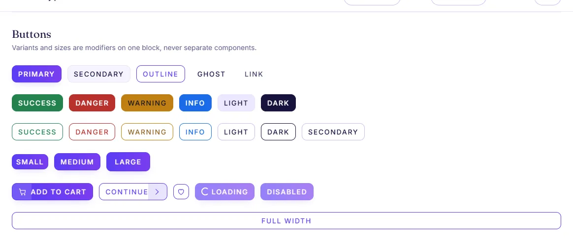
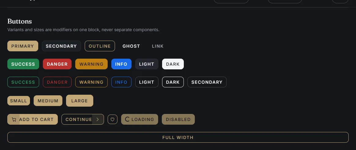
button | Bootstrap 5 button. Emits btn btn-*; the bridge re-points Bootstrap's --bs-btn-* variables at the theme tokens, and adds the two variants Bootstrap lacks (btn-ghost, btn-icon). |
carousel | Swiper wrapper loaded on demand. Reads direction from the document for RTL. |
cart-drawer | Cart contents on the shared overlay engine, rendered from the data source. |
checkbox | Native checkbox with optional trailing count, used by shop filters. |
dropdown | Bootstrap 5 dropdown. Declarative: data-bs-toggle="dropdown"; positioning, dismissal and keyboard handling come from Bootstrap. |
footer | Footer system: rows of columns holding about text, link lists, newsletter, contact, social links, copyright and payment marks. |
header | Header system: up to three rows (topbar, main, bottom) of logo, menu, search and icons. Every storefront has its own; any header works on any page. |
icon | Inline SVG sprite reference. Decorative unless a title is given. |
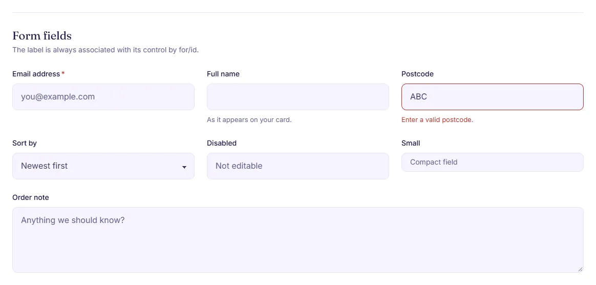
input | Text input field with label, help text and error message. |
modal | Bootstrap 5 modal. Declarative: data-bs-toggle="modal"; backdrop, focus trap, scroll lock and Escape come from Bootstrap. |
nav | Main navigation with mega menu and simple dropdown panels. |
offcanvas | Bootstrap 5 offcanvas. Declarative: data-bs-toggle="offcanvas"; open it from script with bootstrap.Offcanvas.getOrCreateInstance(el).show(). |
pagination | Page navigation with a computed ellipsis window. |
price | Current and previous price. Honours a server-formatted priceHtml when present. |
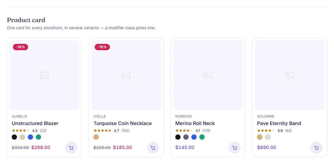
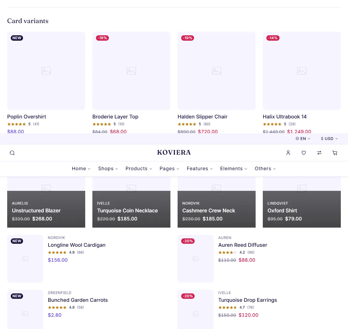
product-card | The most reused component in the product. One block, six variants, no per-niche card. |
product-gallery | Main image, thumbnails, pointer zoom and lightbox. |
quantity | Stepper with min, max and step. Emits vt:quantity:change. |
quick-view | Product summary in a shared modal, read from the page's own quick-view data. No fetch. |
radio | Native radio with optional trailing count. |
rating | Star rating as one masked bar; the accessible value is text, not the stars. |
search | Combobox with suggestions embedded in the page. No fetch. |
select | Native select with label, help text and error message. |
shop-filter | Filters, sorts and paginates the statically rendered grid, with URL state. |
skeleton | Content placeholder. Always hidden from assistive tech. |
spinner | Loading indicator. Decorative unless a label is given. |
sticky-bar | Reveals a compact buy bar once the main add-to-cart scrolls away. |
stock | Low-stock indicator and sold-out state. |
swatches | Renders any product attribute — colour, size, material, storage — from one generic shape. |
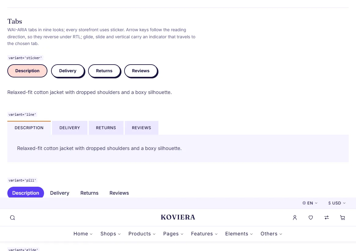
tabs | Bootstrap 5 tabs. Declarative: data-bs-toggle="tab" with data-bs-target; no Koviera JavaScript behind the switching. Nine looks; every storefront uses sticker, the rest are ready to swap in. |
textarea | Multi-line text field. |
tooltip | Bootstrap 5 tooltip. Bootstrap does not auto-initialise these, so a six-line wrapper keeps the VT.mount()/destroy() contract. |
reviews | Product reviews: rating summary with a per-star distribution, verified badges, sorting, helpful voting, review photos, merchant responses and an empty state. Sorting and voting are progressive enhancement over server-rendered markup. |
spec-sheet | Grouped specification table. Feeds the product page, the dense layout and the compare table. The row limit is progressive enhancement over fully rendered markup. |
size-guide | Measurement table chosen by the product's category, rendered inline or inside a modal. Sizing is the most common reason a garment is returned. |
bundle | Frequently-bought-together block for the bundle product layout: companions are pre-ticked, the total recalculates from the DOM, and one button adds the lot. |
coupon | Discount code entry with inline feedback. Codes and minimums come from settings.commerce and travel with the component; no payment or promotion service is involved. |
shipping-estimate | Delivery rate picker with windows and prices, read from settings.commerce. A label and a price, not a carrier integration. |
free-shipping-bar | Progress towards the free-shipping threshold, shown in the cart drawer and on the cart page and kept in step by a document-level binding. |
form-validation | Checkout validation: on blur, then on input once a field has failed, with an error summary at the top linking to each field. Built on the browser's constraint API, so rules live in the markup attributes. |
bottom-nav | Mobile-only bottom bar with the five reachable destinations. Absent above the md breakpoint rather than hidden, and every target is at least 44x44 with 8px between. |
sheet | Turns an offcanvas into a bottom sheet below md: it rises from the bottom, carries a grab handle and can be dismissed by swiping the header as well as by the close button. |
back-to-top | Round button fixed to the bottom inline-end corner, shown after a screen of scrolling, with a scroll-progress ring on its rim. Returns to the top and moves focus to <main>. Opt-in per demo or page variant with backToTop. |
Using a component
Open html/elements.html. Every component and every variant is on that page. Copy the markup you want and paste it into your page. If your page does not link the component's stylesheet yet, copy that <link> too, into the page's <!-- koviera:css --> block in the order html/css/main.css gives. A component with behaviour has a script as well, and starts itself from its data-vt-component attribute; if the page does not link that script yet, add it to the page's <!-- koviera:js --> block — see "JavaScript", "Adding a component to a page".
Sections
33 sections, worn by the storefronts in 89 different layouts.
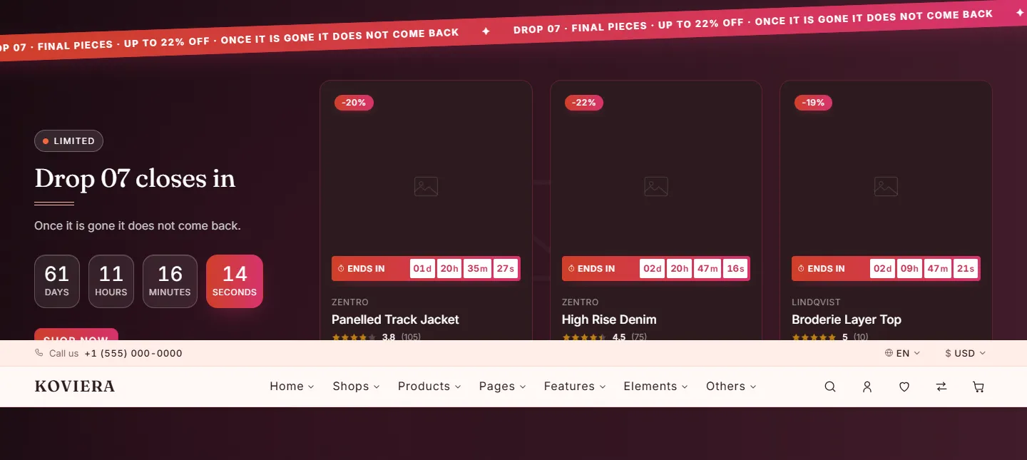
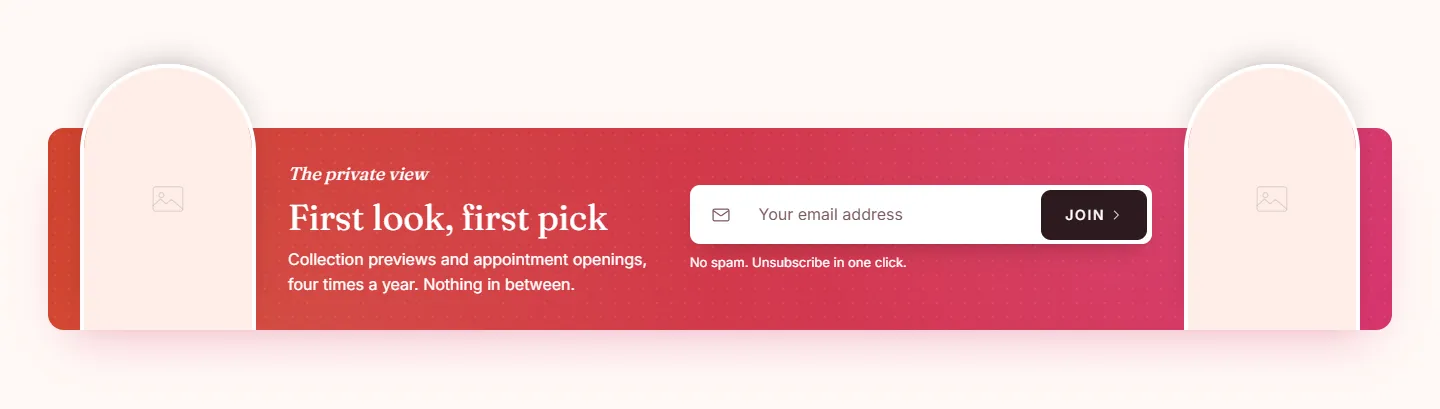
A section is a full-width block of a page — a hero, a product grid, a newsletter. A layout is one way of drawing it: the category grid is a mosaic on Fashion, arches on Perfume & Beauty and stickers on Toys — one section, one stylesheet, three looks.
| Section | Family | Layouts in the demos | What it is |
|---|---|---|---|
announcement-bar | marketing | 6 | Slim promotional strip above the header. |
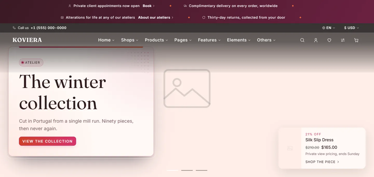
hero-01 | hero | 5 | Large image with the copy beside it, on it, breaking over it, on a floating card, or with a department rail alongside. |
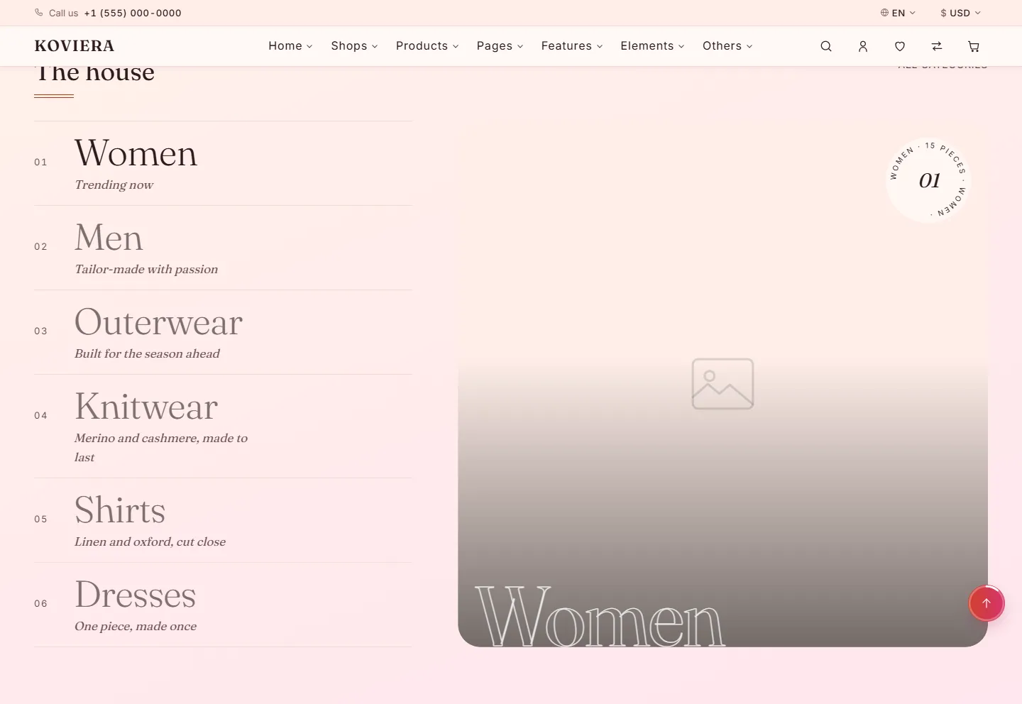
category-grid-01 | category | 8 | Featured categories as image cards. |
glyph-grid-01 | category | 2 | One drawn outline per term of an attribute - a stone shape, a metal - each linking to the shop filtered by it, with the count the shop will show. After the shape-of-gemstone row on a jeweller's homepage. |
price-tiers-01 | category | 1 | Swing tags by budget - under 15, under 25 - each counting what it holds and opening the shop filtered to that ceiling. The way a present is shopped for. |
product-grid-01 | product | 6 | Product grid driven by a query rather than a hard-coded list. |
product-slider-01 | product | 4 | The product grid selection inside a carousel. |
product-feature-01 | product | 2 | One large photograph held against the inline start of the viewport with a product rail beside it running off the opposite edge. After the "member exclusives" block on birkenstock.com. |
banner-01 | marketing | 3 | Image plus copy block, overlaid or side by side. |
lookbook-01 | content | 1 | Editorial image grid with an uneven rhythm. |
instagram-01 | content | 1 | Static image strip linking to a profile. No embed, no network request. |
newsletter-01 | marketing | 6 | Email capture block. |
hero-slider | hero | 4 | Carousel of full-bleed hero slides, each with its own copy, photograph and alignment. |
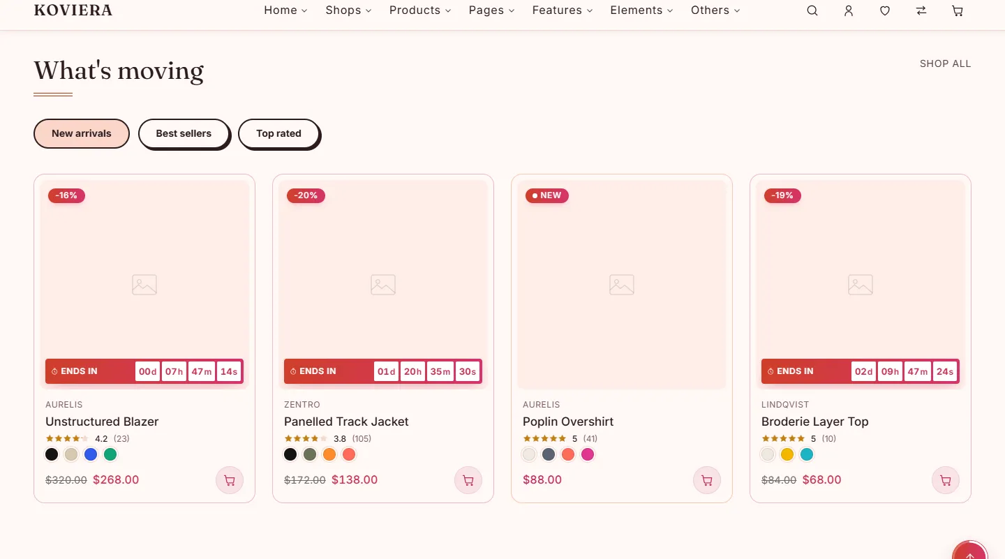
product-tabs-01 | product | 4 | Tabbed product groups, each tab a query against the catalogue. Every panel renders server-side for search engines, so the real cost is limit x tab count — a limit of 8 across three tabs is 24 cards. |
product-grid-banner-01 | product | 2 | Product grid with a promotional tile in one cell. |
product-masonry-01 | product | 1 | Masonry product layout using CSS columns and mixed image ratios. |
product-pair-01 | product | 1 | Two named products presented as one routine: numbered steps, a join between them, and one button that adds both. After the "a daily double act" block on aesop.com. |
product-compare-01 | product | 1 | A range shown one at a time: the centred product at full size with its name, notes and price, its neighbours shrunk either side. After the "compare our fragrances" rail on aesop.com. |
recently-viewed-01 | product | 1 | Per-visitor history. The catalogue renders hidden and the module reveals what was seen. |
category-slider-01 | category | 1 | Category carousel sharing the card with the category grid. |
banner-grid-01 | marketing | 3 | Two, three or four promotional tiles in a row. |
countdown-01 | marketing | 3 | Deadline promotion with optional product grid. |
promo-popup-01 | marketing | 1 | Sale offer as a ticket-shaped dialog that opens by itself after the page loads, with a discount figure, a running clock, a copyable code and a tab that brings it back once closed. |
cta-01 | marketing | inner pages | Centred copy block with one or two buttons. |
benefits-01 | marketing | 4 | Shipping, returns, support and payment reassurance. |
service-tiles-01 | marketing | 1 | A row of flat tiles linking to the service pages: contact, order status, delivery, store finder, returns, help. Tiles are named by key, so the icon, the word and the destination cannot be authored out of step. |
blog-grid-01 | content | 1 | Latest posts as a grid or a carousel. |
testimonials-01 | content | 3 | Customer quotes with ratings. |
brands-01 | content | 3 | Brand wordmark strip. Every mark is authored for this template. |
editorial-01 | content | 5 | Image beside a longer copy block. |
stats-01 | content | 2 | Four figures about the store, written in the page. |
faq-01 | content | 2 | Question list with FAQPage structured data. |
sale-strip-01 | marketing | 1 | A band of offers that lands on the bottom edge of the hero above it. |
Building a page from sections
html/sections.html shows every layout the storefronts use, each in the palette of the storefront it comes from, and wrapped in an element carrying class="vt-section" data-vt-section="..." — a <section>, or a <div> for a block with no heading, such as a hero or a strip. To add one to a page, copy that element whole and paste it between two sections of your page. Its styles are in html/css/sections/; if the page does not link that file yet, add the <link> to the page's <!-- koviera:css --> block, in the order html/css/main.css gives.
To rearrange a homepage, move its vt-section elements; to remove a block, delete one.
Pages
80 pages. html/index.html is the preview landing and links to every one.
Storefronts
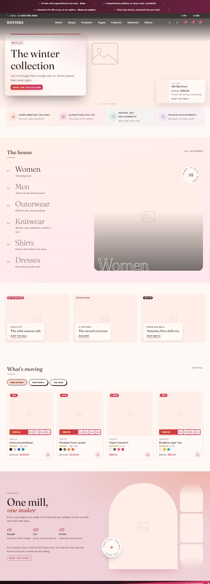
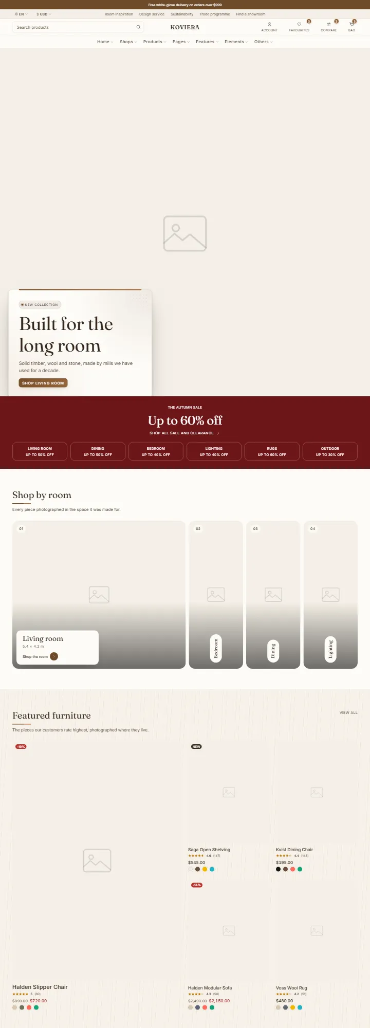
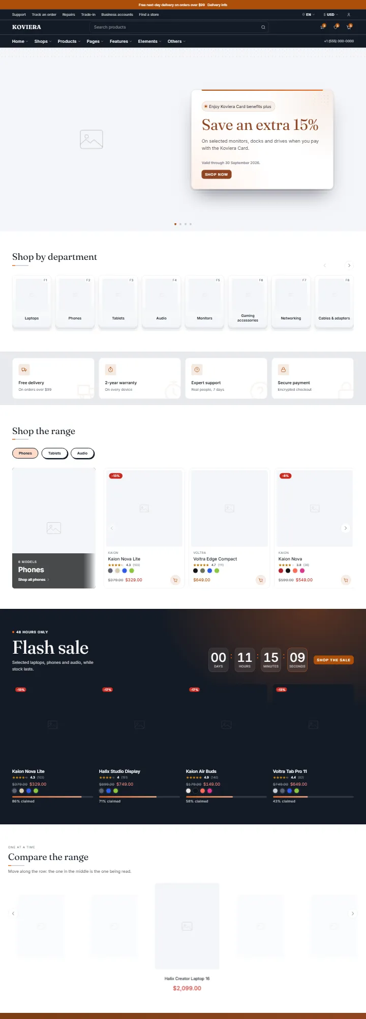
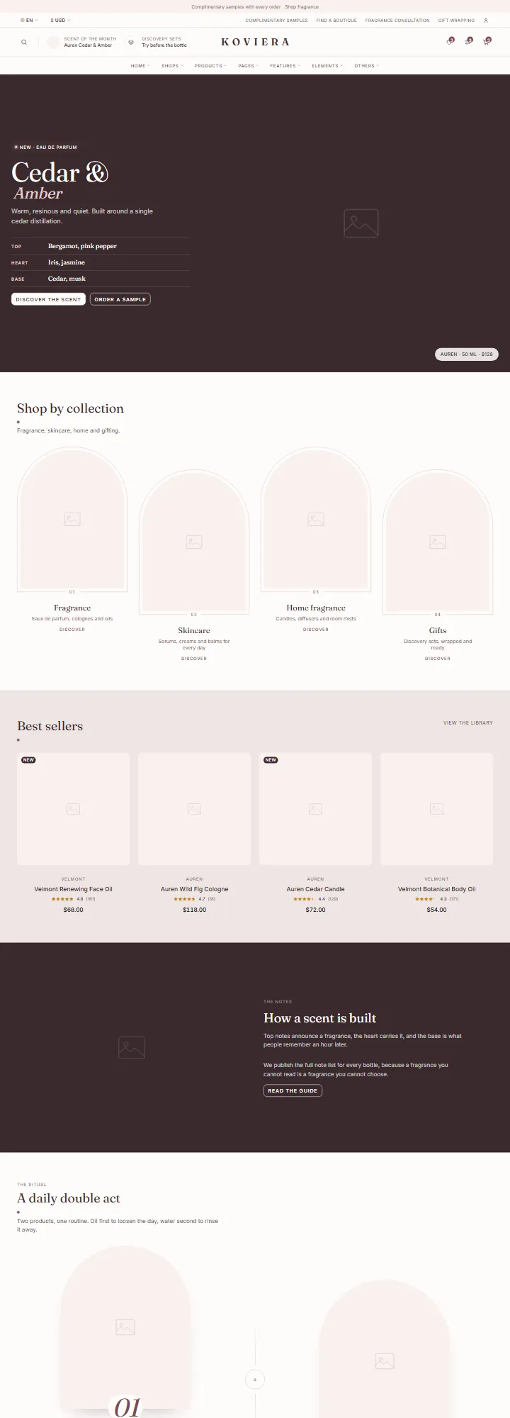
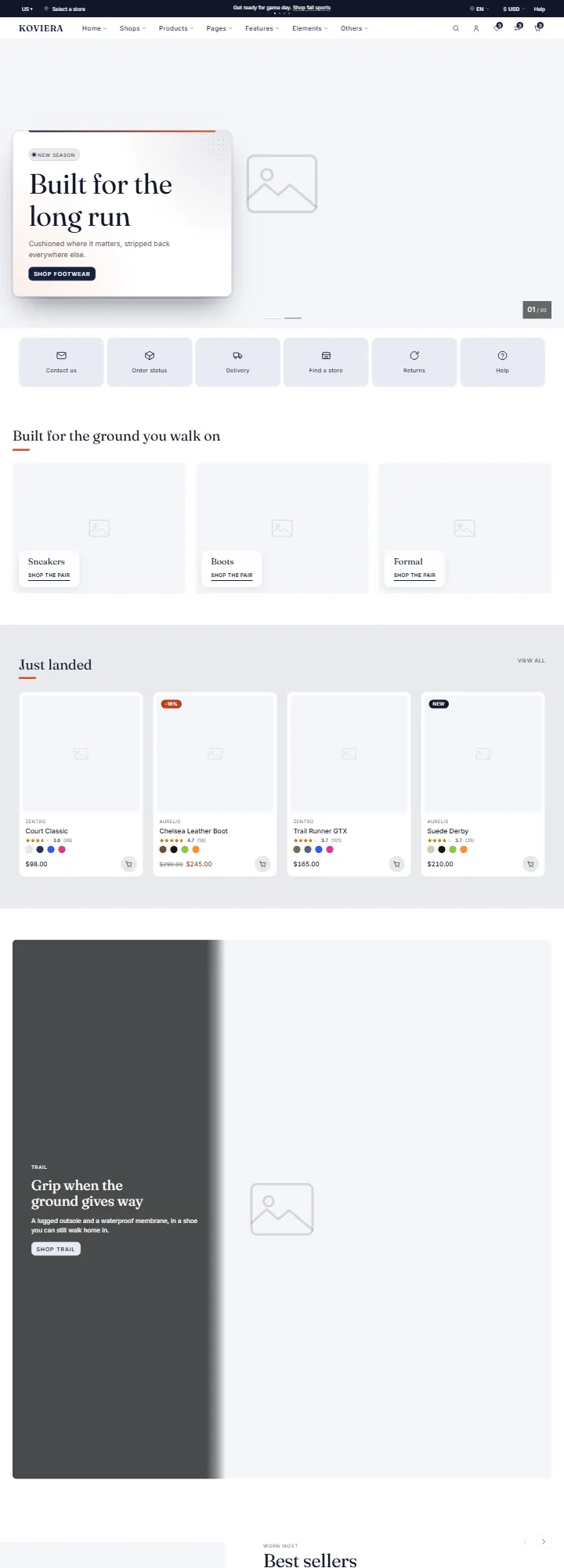
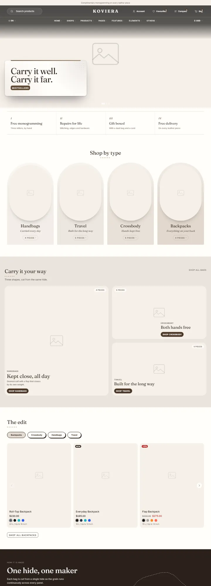
Ten homepages, each with its own palette, header, footer and button hover, and each with a matching shop and product page:
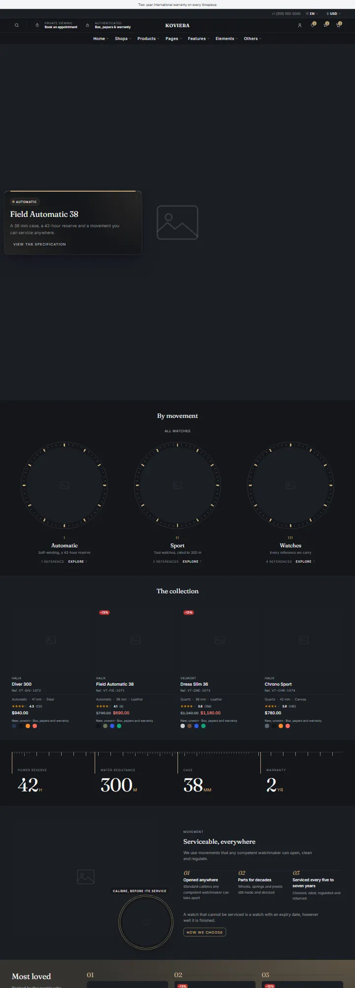
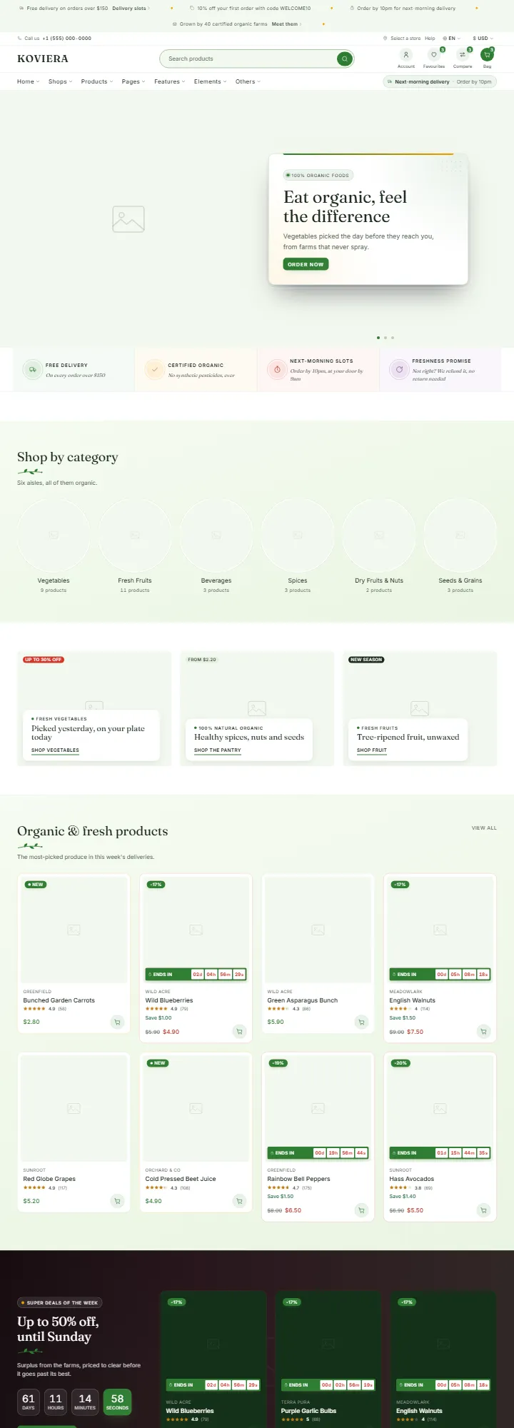
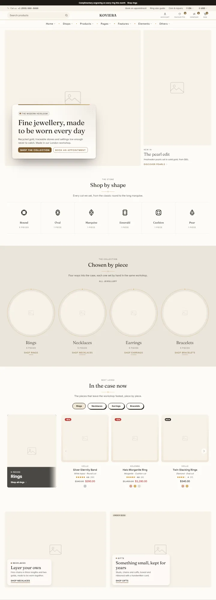
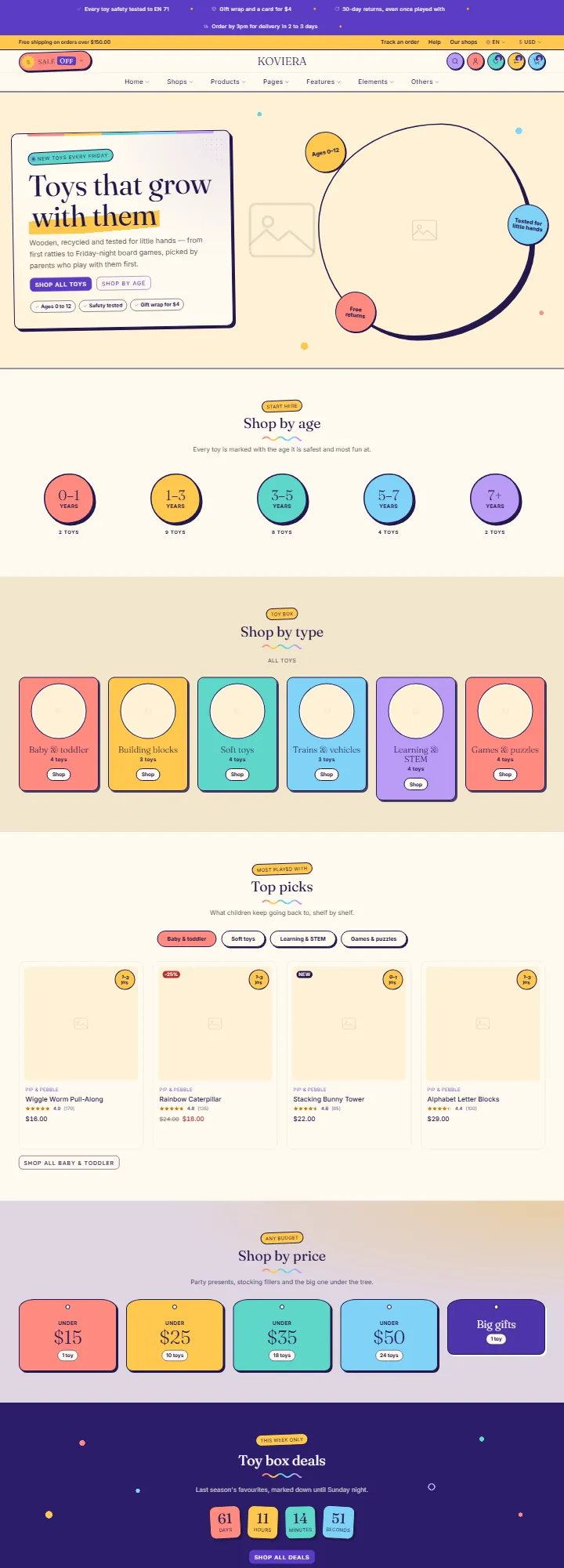
| Storefront | Home | Shop | Product |
|---|---|---|---|
| Fashion | home-fashion.html | shop-fashion.html | product-fashion.html |
| Furniture | home-furniture.html | shop-furniture.html | product-furniture.html |
| Electronics | home-electronics.html | shop-electronics.html | product-electronics.html |
| Perfume & Beauty | home-perfume.html | shop-perfume.html | product-perfume.html |
| Shoes | home-shoes.html | shop-shoes.html | product-shoes.html |
| Bags | home-bags.html | shop-bags.html | product-bags.html |
| Watches | home-watches.html | shop-watches.html | product-watches.html |
| Organic | home-organic.html | shop-organic.html | product-organic.html |
| Jewellery | home-jewelry.html | shop-jewelry.html | product-jewelry.html |
| Toys | home-toys.html | shop-toys.html | product-toys.html |
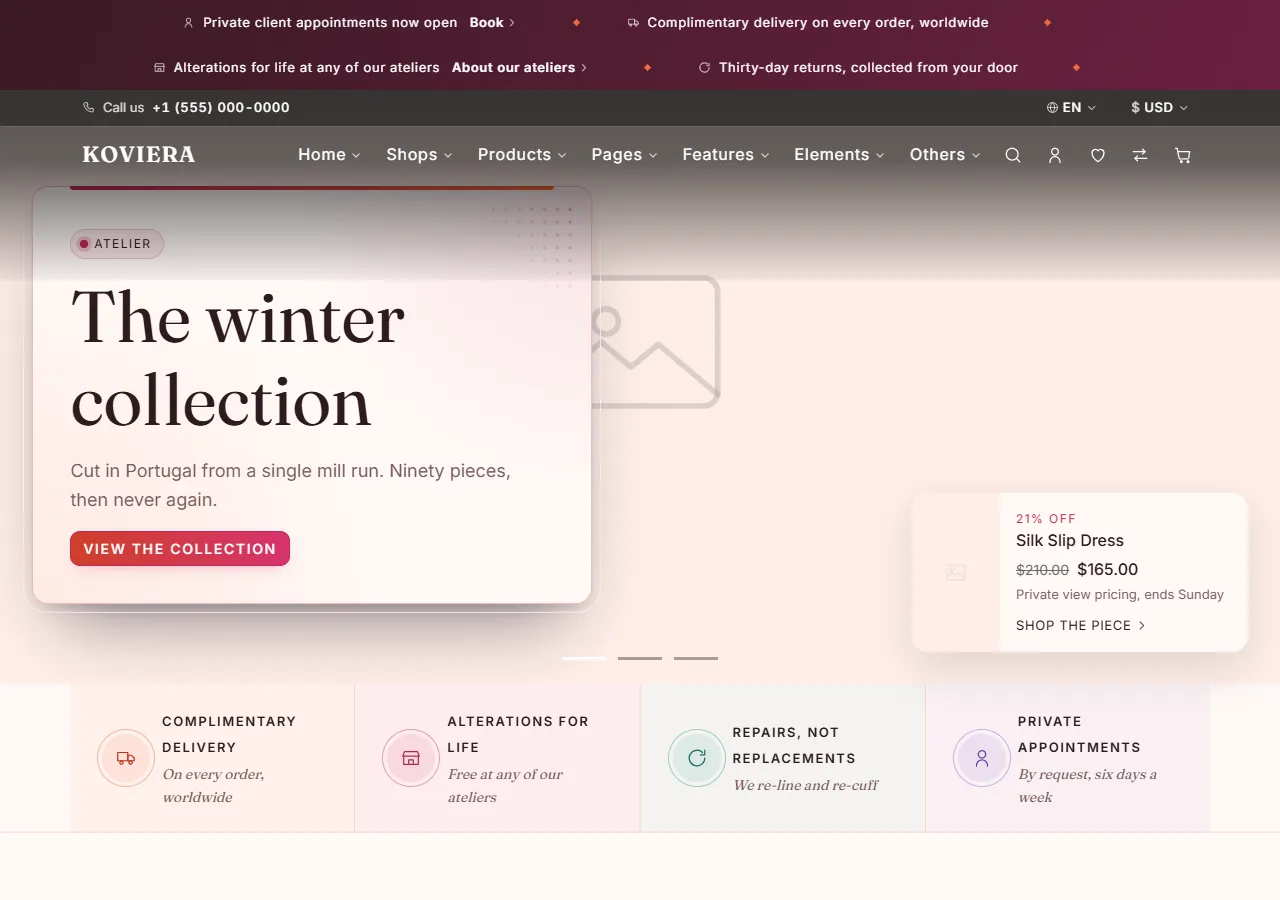
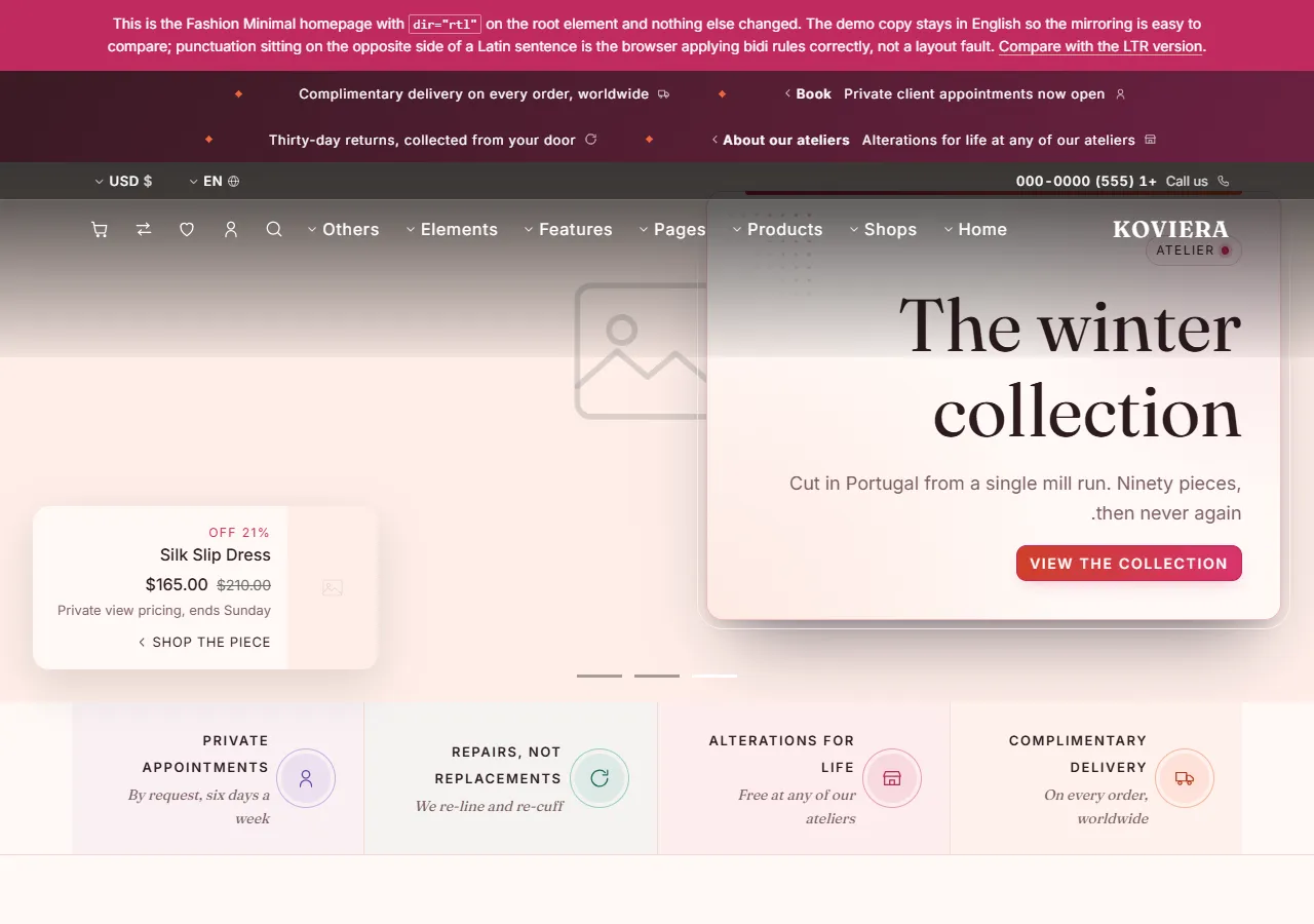
rtl.html is the Fashion homepage right to left.
Shop layouts
| Page | Layout |
|---|---|
shop.html | Sidebar, three columns |
shop-grid-4.html | No sidebar, four columns |
shop-sidebar-end.html | Sidebar on the end edge |
shop-list.html | List view |
shop-filter-top.html | Filters in a drawer |
category.html | Category archive |
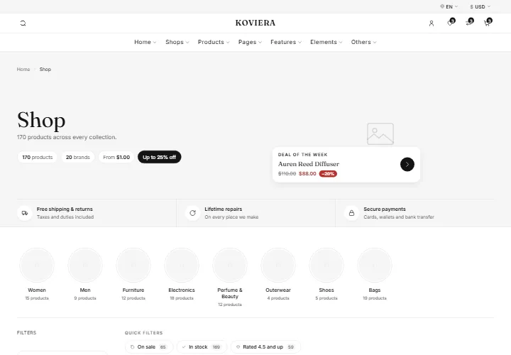
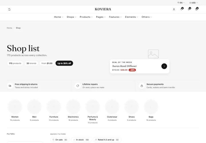
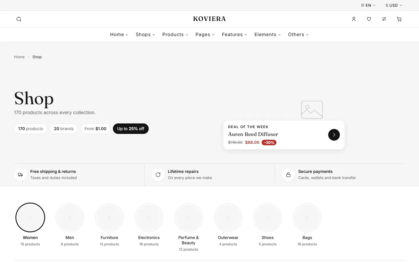
The filters work: category, brand, price, colour, size, rating and availability, with sorting, a grid/list switch and pagination. Filter state is written into the URL, so a filtered view can be shared and survives a reload.
Every product is in the HTML. The filter decides what is visible, which keeps the page indexable and readable with JavaScript off. To add a product, copy a <li class="vt-shop__item"> and change it; the filters read the card itself. The numbers beside each filter option ("Women 6") are plain text — update them if you add or remove products.
Product layouts
product-default.html, product-editorial.html and product-dense.html, plus the storefront product pages above. The gallery, price, rating, swatches, quantity, accordion and tabs are the same components everywhere.
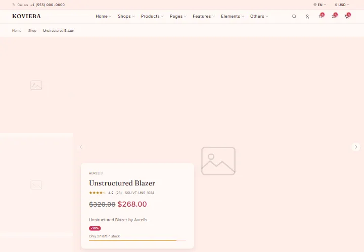
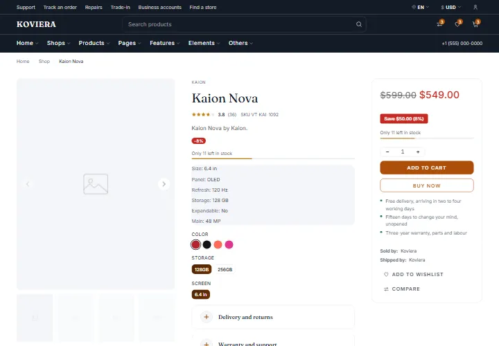
product-fashion.html is the one that rearranges the top of the page rather than the column beside it. The gallery runs the full width of the window and as much of its height as the header leaves; the block that names the piece rests on the bottom corner of the photograph as an opaque panel, and colour, size, quantity, the buy button and the panels sit below. On a phone the naming block comes back into flow under the gallery, so the price is never a full swipe away.
Cart, checkout and orders
cart.html, cart-empty.html, checkout.html, checkout-steps.html, checkout-one-page.html, checkout-minimal.html, order-success.html, order-tracking.html.
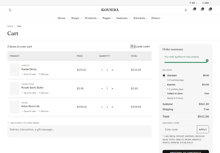
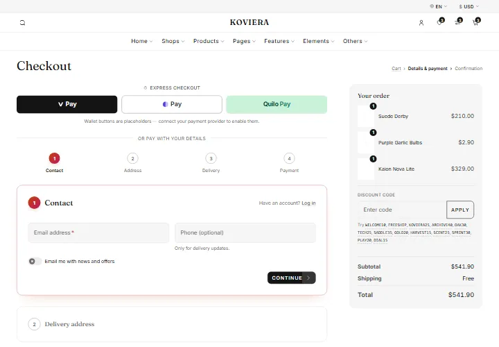
The cart page, the drawer and the checkout summary all read from one data source, so they cannot disagree.
Shipping rates are the radio buttons in the cart and checkout summary:
<input type="radio" name="cart-shipping" value="express"
       data-vt-shipping-rate data-vt-price="14" data-vt-label="Express" />
Change data-vt-price and the label, on cart.html, the checkout pages and shipping.html. The free-shipping threshold is data-vt-free-shipping on <body>.
Coupons the demo accepts are listed in a <script type="application/json" data-vt-coupons> block on the same pages — a code, a type (percent, fixed or shipping) and a value. Real coupons must be checked on your server; this list is for the demo only.
Account
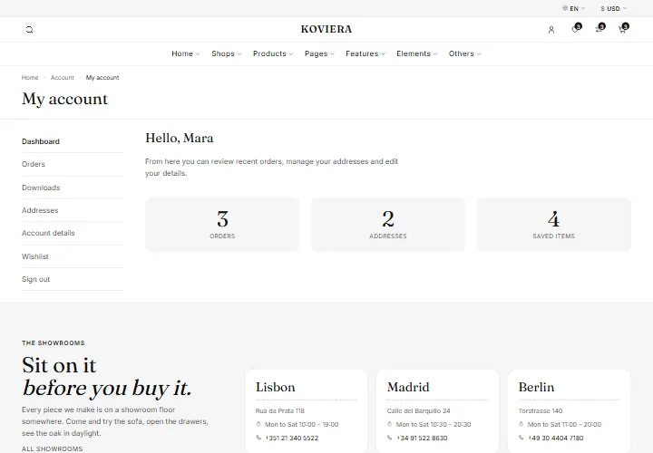
login.html, register.html, forgot-password.html, account.html, account-orders.html, account-order.html, account-downloads.html, account-addresses.html, account-details.html.
Blog
blog.html, blog-list.html, blog-sidebar.html, blog-masonry.html, blog-single.html, blog-author.html.
Everything else
about.html, contact.html, stores.html, faq.html, search.html, size-guide.html, shipping.html, terms.html, privacy.html, 404.html, coming-soon.html, wishlist.html, compare.html.
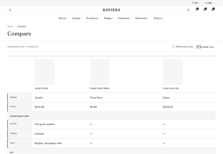
And three reference pages for building your store, which you will usually delete before launch: elements.html, sections.html, tokens.html.
Terms and privacy
Each document is a title, an "updated" date and numbered clauses, with a table of contents at the top. The copy shipped with the template is a model, not legal advice. Replace it with a version written for your business before you launch, and delete the notice at the top of the page once you have.
Size guide
size-guide.html holds every chart, one tab each. The centimetres/inches switch converts any column whose heading ends in (cm) and leaves every other column alone. Name a new measurement column the same way and it converts; name it anything else — UK, EU, US — and it is left as a label.
FAQ
faq.html groups its questions in accordions and carries one FAQPage structured-data block covering every question. The search filters the questions already in the page, so editing them gives you a search over your own words with nothing to rebuild. If you change a question, change it in the <script type="application/ld+json"> block after the questions as well.
Forms
The contact, newsletter, account and checkout forms submit nowhere real on purpose — a template cannot ship a backend. Point them at your own handler:
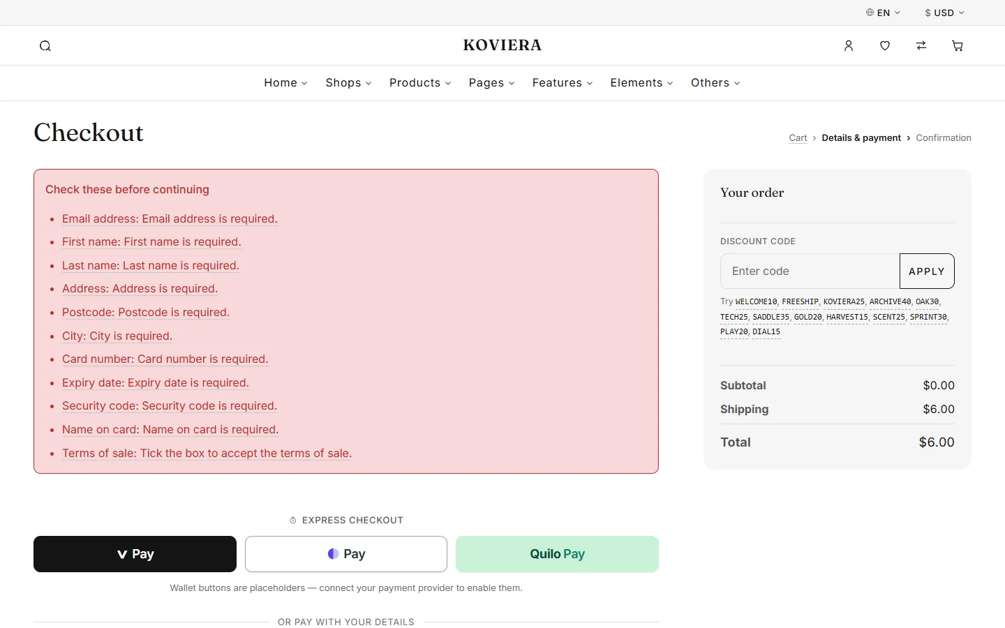
<form action="https://your-handler.example/subscribe" method="post">Use method="post" for anything carrying a password or personal details. For checkout, connect the form to your payment provider's hosted checkout or tokenised fields before going live, and validate everything again on your server.
The checkout and the contact form share a validation module, data-vt-component="form-validation". It reads the constraint attributes already on the markup (required, type, pattern), so you change validation by editing an attribute, not JavaScript. Two pieces of markup are opt-in:
data-vt-label="Your name"on a field sets what the message says instead of the field id.- A
[data-vt-error-summary]box holding a[data-vt-error-list]gets the list of problems on a failed submit. Leave it out and fields are still marked, but nothing is summarised at the top.
Header and footer
Each storefront has its own header and footer, and the shop, account, blog and content pages share a default pair. They are all built from the same parts, so any header works on any page.




Using another header
Every header is a single <header class="vt-header ..."> element near the top of the page. To give a page the header you saw on another one, copy that element across whole and replace the page's own. The storefront homepages are the quickest place to find each design:
| Header class | Seen on |
|---|---|
vt-header--header-01 | shop, account, blog, checkout and content pages, and the landing, elements, sections and tokens pages |
vt-header--header-02 | home-fashion.html |
vt-header--header-03 | home-organic.html |
vt-header--header-07 | home-watches.html |
vt-header--header-08 | home-furniture.html |
vt-header--header-10 | home-perfume.html |
vt-header--header-11 | home-shoes.html |
vt-header--header-12 | home-bags.html |
vt-header--header-13 | home-electronics.html |
vt-header--header-15 | home-jewelry.html |
vt-header--header-16 | home-toys.html |
vt-header--transparent lays the header over the hero until the page scrolls; remove it for a solid header.
Rows
A header has up to three rows, each a .vt-header__row: --topbar (the thin strip of text and links), --main (logo, search, icons) and --bottom (the menu). Delete a row to remove it. vt-header__row--hide-sm and vt-header__row--hide-md hide a row on phones and on tablets.
The menu
Every page, checkout and the reference pages included, carries the same menu — Home, Shops, Products, Pages, Features, Elements and Others — with the same links in the same order, so a visitor who learns it on one storefront finds everything in the same place on the next. What changes per storefront is how it looks: where the header puts it, its colours, and how each panel opens.
| Item | Holds |
|---|---|
| Home | The ten storefront homepages, all demos and the right-to-left demo |
| Shops | Each storefront's shop, and the five shop layouts, category and search |
| Products | Each storefront's product page, and the three product layouts |
| Pages | About, contact, store locator, FAQ and the six journal pages |
| Features | Cart and the four checkouts, order pages, account pages, wishlist, compare |
| Elements | Components, sections and design tokens |
| Others | Shipping, size guide, terms, privacy, 404 and coming soon |
Each panel is arranged one of nine ways, named by a class on its .vt-nav__panel: vt-mega--columns (lists side by side), --tabs (groups down the side, one open at a time), --cards (each group as a picture card), --compact (a dropdown as wide as its lists), --banner (lists with an offer underneath), --editorial (a large picture beside the lists), --tiles (the storefronts as a mosaic of pictures, the other links along its foot), --products (the lists beside a few of the storefront's own products) and --showcase (the lists beside one product or story in the light). Elements and Others are plain dropdowns (vt-nav__panel--simple). Some panels also set their links as pills or with a small picture, or end on a strip of the storefront's services (marked + below). The arrangements differ in markup as well as style, so to switch one, copy that item's whole <li class="vt-nav__item ..."> from a storefront that uses the arrangement you want — the links inside are the same on every page; the product cards and services are extras pointing at pages the menu already lists.
| Storefront | Home | Shops | Products | Pages | Features |
|---|---|---|---|---|---|
| Shared pages | columns | tabs | tabs | columns | columns |
| Fashion | tiles | columns | products | columns | columns |
| Furniture | cards | cards + | cards | columns | columns |
| Electronics | columns | tabs | products | compact | banner |
| Perfume | editorial | cards | columns | columns | columns |
| Shoes | tabs | tabs + | products + | compact | compact |
| Bags | compact | compact | products + | compact | compact |
| Watches | editorial | columns | products + | columns | columns |
| Organic | columns | products + | columns | compact | compact |
| Jewellery | editorial | showcase + | showcase | compact | compact |
| Toys | cards | showcase + | showcase | compact | compact |
To add, rename or remove a link, change it in the header menu (<nav class="vt-nav" aria-label="Main">) and in the phone menu (#vt-mobile-nav) of every page, so the two never disagree.
Sticky behaviour
Set on the header's options:
<header class="vt-header ..." data-vt-component="header"
data-vt-options='{"sticky":"on-scroll-up"}'>| Value | Behaviour |
|---|---|
none | Scrolls away with the page |
always | Fixed to the top once you scroll past it |
on-scroll-up | Hides going down, returns going up |
Mobile
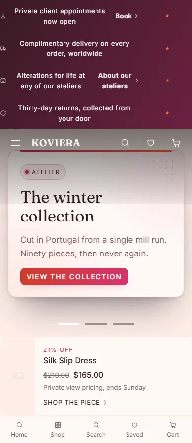
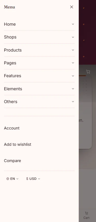
Below 1024px every header hands its menu and search to the burger and the drawers, which are separate elements near the end of the page (#vt-mobile-nav, #vt-search-drawer). They come with every page, so a copied header needs nothing else.
Footers
The same idea: one <footer class="vt-footer ..."> element, rows of columns holding the about text, link lists, the newsletter form, contact details, social links, the copyright line and payment marks. Copy a footer whole to use it on another page; delete a column to remove it.
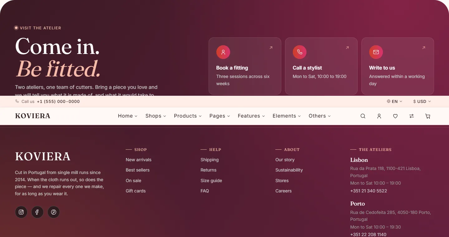
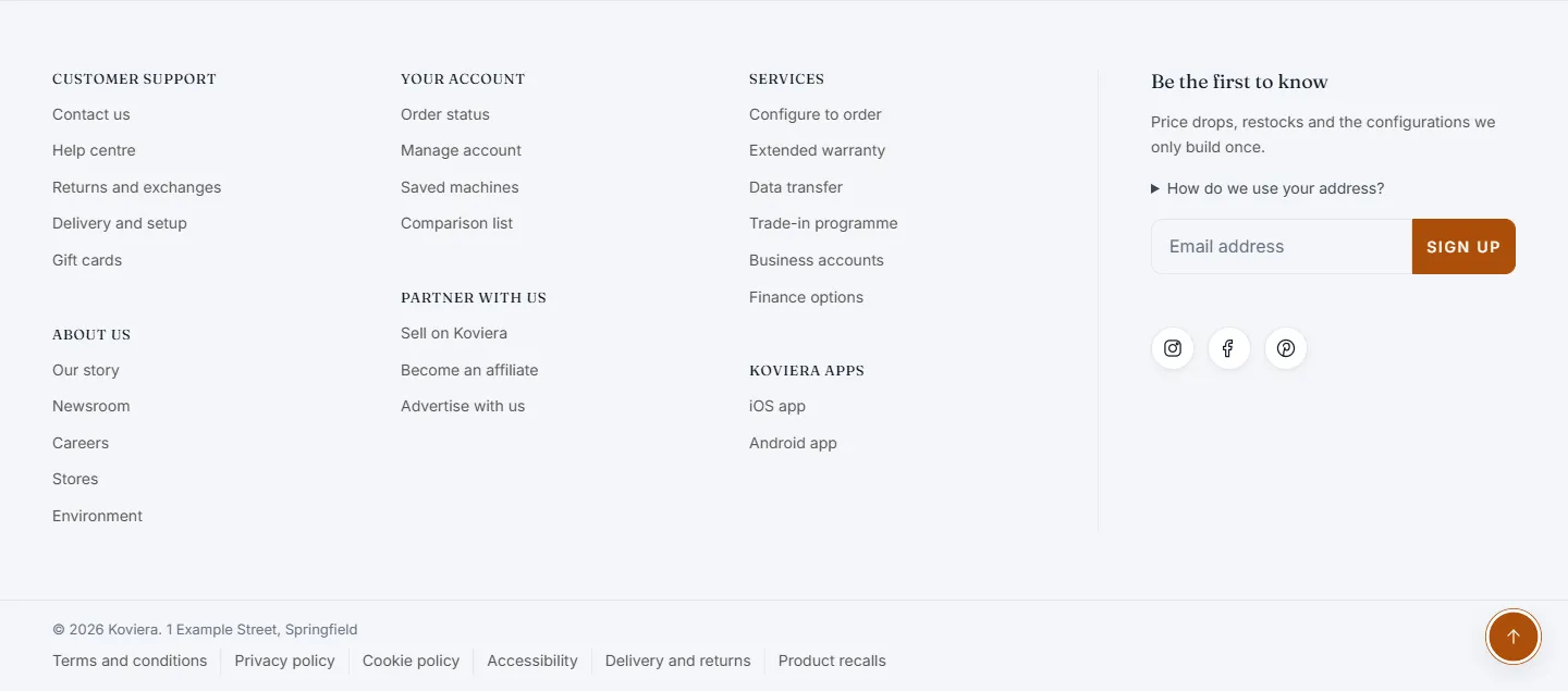
The newsletter form submits nowhere until you connect it — see "Pages", "Forms".
Customising
Everything below is an edit to one of the files in html/css/ or to the pages themselves. Reload and it shows. If your pages link the minified files, run npm run build afterwards — see "Minified build".
Changing colours
Every colour in the template comes from a token. Each page names its palette on the <html> tag:
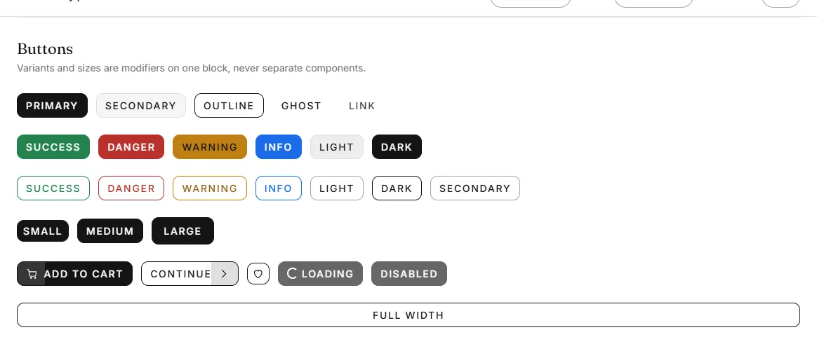
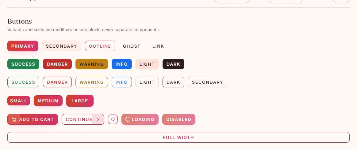
<html lang="en" dir="ltr" data-vt-theme="blush">Sixteen palettes ship: default, blush, luxury, minimal, streetwear, furniture, electronics, mobile, perfume, shoes, bags, watches, organic, jewelry, toys, and showcase — the violet the preview landing and reference pages wear. Each is one file in html/css/themes/, and a page links only its own. To switch a page's palette, change the attribute and the theme's <link> in the page's <!-- koviera:css --> block:
<link rel="stylesheet" href="./css/themes/blush.css" />To make your own, copy the file for the palette you are closest to, give it a new name, and change the selector and the semantic tokens, not the primitives:
[data-vt-theme="mine"] {
  --vt-c-primary: #1c4d3a;
  --vt-c-heading: #101815;
  --vt-c-bg-soft: #f3f6f4;
}
Every button, badge, link and price follows. No component CSS to touch.
Important
any token that carries text must reach 4.5:1 contrast against both --vt-c-bg and --vt-c-bg-soft. html/tokens.html shows every token with a live sample, which is the quickest way to check.
Changing typography
In html/css/tokens/typography.css:
:root {
  --vt-font-sans: "Your Sans", system-ui, sans-serif;
  --vt-font-serif: "Your Serif", georgia, serif;
}
Sizes use clamp(), so headings scale between small and large screens without breakpoints. Adjust --vt-text-* to retune the scale.
To self-host a font, put the files in html/assets/fonts/ and change the @font-face blocks in html/css/base/fonts.css, keeping font-display: swap. html/assets/fonts/README.txt has the details.
Changing the mode
Type, corners and spacing come from a mode, named on the <html> tag beside the palette. Every page ships in editorial — serif headings, soft rounded corners (10 px on buttons, fields and pictures, 16 px on cards, pill badges), a wide rhythm — so the ten storefronts share one shape and differ only in colour and button hover:
<html lang="en" dir="ltr" data-vt-theme="toys" data-vt-mode="editorial">
<link rel="stylesheet" href="./css/modes/editorial.css" />
html/css/modes/ holds five more — minimal, commerce, refined, bold and playful. To switch, change the attribute and the mode's <link> together. A mode holds no colour, so any mode works with any palette. Switch every page at once to keep the site consistent.
Section grounds
Each section on a page sits on one of five grounds, set by a class on its <section>. The storefront homepages alternate them so that no two plain sections follow each other, and each has one tinted block about halfway down the page:
| Classes | Ground |
|---|---|
vt-section | The page's own ground |
vt-section vt-section--soft | A soft band from edge to edge |
vt-section vt-section--dark | A dark band |
vt-section vt-section--soft vt-section--panel | A soft band, kept apart from a flush neighbour |
vt-section vt-section--tint vt-section--panel | A band washed with the palette's primary colour |
To change a section's ground, change its classes. Every ground runs from edge to edge, so changes of ground meet in straight lines.
Changing the logo
The logo is text, in the header and footer of every page:

<a class="vt-logo vt-logo--md" href="index.html" aria-label="Koviera home">
  <span class="vt-logo__text">Koviera</span>
</a>
To use an image, replace the <span> with an <img> carrying explicit width and height — every image in this template has them, which is why layout shift is zero. Change the aria-label to your store's name.
Replacing the images
Every photo slot is assets/images/placeholder.svg. Point the <img> at your file, drop the vt-image--placeholder class, and keep width and height at the image's real proportions:
<img class="vt-image" src="assets/images/products/linen-shirt.jpg"
     alt="Linen shirt in sand" width="600" height="800" />
On a product card, change "image" inside the data-vt-product attribute of the card's buttons as well — that copy is what the cart, the wishlist and compare display.
The back-to-top button
Every page has one except the preview landing. It stays hidden until the page has been scrolled a screen's worth, so short pages never show it, and it lifts itself clear of the phone's bottom navigation and the product page's sticky buy bar. To remove it from a page, delete the element:
<button class="vt-back-to-top" type="button" data-vt-component="back-to-top" ...>The sale popup
Each storefront homepage opens a sale offer a few seconds after it has loaded: a ticket with the discount printed across a photograph, a running clock, a code to copy and a button to the shop. Closed, it stays closed for a day and leaves a small tab in the corner of the screen that brings it back.
It is the block after the drawers, near the end of <body> on each home-*.html:
<div class="vt-promo-popup" data-vt-section="promo-popup-01" data-vt-component="promo-popup"
data-vt-options='{"key":"vt-promo-fashion","delay":3,"afterPages":2,"snoozeDays":1,"teaser":true}'>| Option | What it does |
|---|---|
delay | Seconds after the page has loaded before the offer opens |
afterPages | The page of the visit it first opens on; 2 leaves the first page clear, 1 opens on the first |
snoozeDays | Days it stays shut once it has been closed or the button followed |
teaser | false drops the corner tab; delete the vt-promo-teaser block too |
key | Where the visitor's choice is remembered; change it to show again |
The words, the figure, the code and the link are plain HTML inside the block. A code typed at checkout has to exist in the data-vt-coupons list on the cart and checkout pages (see "Cart, checkout and orders"); every code the demos print is there already. Without a code, delete the vt-promo__code block and the status line after it.
The look follows the page's theme. vt-promo__stub--soft on the stub gives it the theme's soft ground; vt-promo__stub--dark together with vt-section--dark turns it dark.
Add ?promo to the address to open it straight away while editing. Browsers run by automation tools are left alone unless the address carries ?promo. To remove the popup from a page, delete the block and the js/components/promo-popup.js script line.
Changing the button hover
Every button on a page shares one hover, set by a class on <body>:
<body class="vt-body ... vt-buttons--skew">| Class | The gesture | Used by |
|---|---|---|
vt-buttons--ripple | A disc opens from the centre and fills the button | Furniture, every page outside a storefront |
vt-buttons--skew | A slanted panel slides in from the inline start | Fashion |
vt-buttons--rise | The fill wipes straight up from the bottom edge | Bags |
vt-buttons--shutter | Two bands close in from the top and bottom and meet | Shoes |
vt-buttons--unfold | The fill opens from the centre line out to both edges | Watches |
vt-buttons--scan | The fill crosses the button behind a bright leading edge | Electronics |
vt-buttons--bloom | The fill fades in and settles, with no edge and no direction | Perfume |
vt-buttons--sprout | A domed fill rises out of the bottom edge with a slight spring | Organic |
vt-buttons--gleam | The fill fades in while a band of light crosses the button once | Jewellery |
vt-buttons--pop | The button lifts off the page onto a hard shadow | Toys |
Swap the class to swap the gesture. Only the motion changes: shape, border and weight at rest come from the mode, so every storefront's buttons match until the pointer reaches one. The fills are the same pseudo-element restyled — .btn::before — so none adds markup. Eight of them live in html/css/base/bootstrap-bridge.css, which every page loads; gleam and pop have their own files, base/button-gleam.css and base/button-pop.css, so a page switching to one of those links that file too.
Changing the product card
There is one product card with variants, chosen by a modifier class on the <article>:
<article class="vt-product-card vt-product-card--overlay" ...>html/elements.html shows every variant — default, minimal, overlay, horizontal, list and the storefront-specific ones — side by side. Copy the one you want. Optional parts (rating, swatches, quick view, the stock bar) are separate elements inside the card: delete the element to remove the part.
The card's styles are in html/css/components/product-card.css; two storefront variants have files of their own, product-card-plinth.css and product-card-toybox.css, linked only by the pages that use them.
JavaScript
Koviera's own code is vanilla JavaScript, one readable file per component in html/js/. No jQuery anywhere, and no ES modules, so pages work straight from disk. Bootstrap 5 is in html/js/libs/ and its API is on window.bootstrap.
How the files fit together
Each file is a classic script wrapped in a function, so nothing leaks into the page. It registers what it offers on one shared object and reads what it needs from the same object:
(function () {
  'use strict';

  const { isRtl } = window.KovieraModules['core/dom'];

  function carousel(el, options = {}) { ... }

  window.KovieraModules = window.KovieraModules || {};
  window.KovieraModules['components/carousel'] = { carousel };
})();
Each page loads, in dependency order, between <!-- koviera:js --> and <!-- /koviera:js -->, with defer, only what it uses: the core files every page needs, then the file of each component on the page. js/core/app.js comes last: it registers the components whose files the page linked, and starts them.
Tip
Koviera and Bootstrap do not overlap: Koviera components mount from data-vt-component, Bootstrap's from data-bs-*. Never put both on one element.
How components start
A component binds to a data-vt-component attribute, never to a CSS class — so you can rename styling classes freely without breaking behaviour.
<div class="vt-carousel" data-vt-component="carousel"
     data-vt-options='{"slidesPerView":4}'>
Everything is mounted on load. If you inject markup yourself, mount it:
VT.mount(container);     // start components inside container
VT.destroy(container);   // tear them down before removing it
VT is on window, so this works from a plain script tag too.
Without JavaScript
Every page still reads and navigates with JavaScript switched off. A one-line script in each page's <head> puts vt-js on <html>, and css/utilities/no-js.css styles the page for when it is missing:
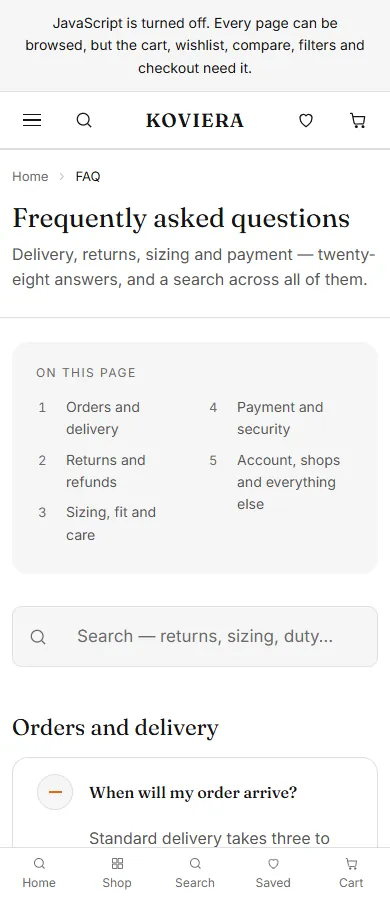
- Accordions, FAQ answers and every tab panel are open. The one exception is a homepage product-tabs row that sorts one catalogue three ways (new in, best sellers, on sale): it keeps its first list rather than repeating the same products.
- Carousels become a row you scroll sideways, each slide as wide as the carousel's
slidesPerViewmakes it. The widths are written onto each carousel as--vt-pvand--vt-gapcustom properties, one pair per breakpoint — keep them when you copy a carousel. - The shop lists the whole catalogue in one column, without the filters.
- The cart and search icons are links to
cart.htmlandsearch.html, and the menu icon opens the mobile menu as a link to#vt-mobile-nav. - Buttons only a script can answer — add to cart, quick view, wishlist, compare, the pager, carousel arrows — are hidden, and a notice at the top of the page says that the cart, wishlist, compare, filters and checkout need JavaScript.
With JavaScript on, none of these rules match and nothing changes.
Adding a component to a page
Copy the component's markup, then check the page's <!-- koviera:js --> block for its script — js/components/<name>.js, or js/ecommerce/<name>.js for the cart, checkout and shop components. If it is not there:
- Find a page that already uses the component —
elements.htmlhas almost all of them — and copy the component's<script>line from its block, along with any line your page lacks that the script reads. A script names what it reads at its top:window.KovieraModules['core/dom']isjs/core/dom.js. - Paste them into your page's block, in the order they appear on that page, and always before
js/core/app.js.
A page missing a component's script says so in the browser console: VT.mount: no component registered for "carousel". The carousel and the product gallery also need Swiper; see "Heavy libraries".
Available components
back-to-top, bundle, carousel, cart-drawer, cart-page, countdown, coupon, faq-search, form-validation, header, order-confirmation, picker, product-gallery, promo-popup, quantity, recently-viewed, reviews, saved-list, search, sheet, shipping-estimate, shop-filter, spec-sheet, sticky-bar, tabs-indicator, toc, tooltip, unit-switch, video-embed.
Modals, offcanvas drawers, dropdowns, tabs and accordions are plain Bootstrap, started from data-bs-* attributes.
Settings
Set before the scripts load, in the page's <head>:
<script>
  window.VT_CONFIG = { currency: 'EUR', locale: 'de-DE' };
</script>
currency and locale format every price the script writes — the cart, the drawer, the checkout summary. Prices already written into the HTML are plain text; edit them where they are. The free-shipping threshold the cart counts towards is data-vt-free-shipping on <body>.
Opening a dialog from anywhere
The drawers are Bootstrap offcanvas elements, so any button opens one:
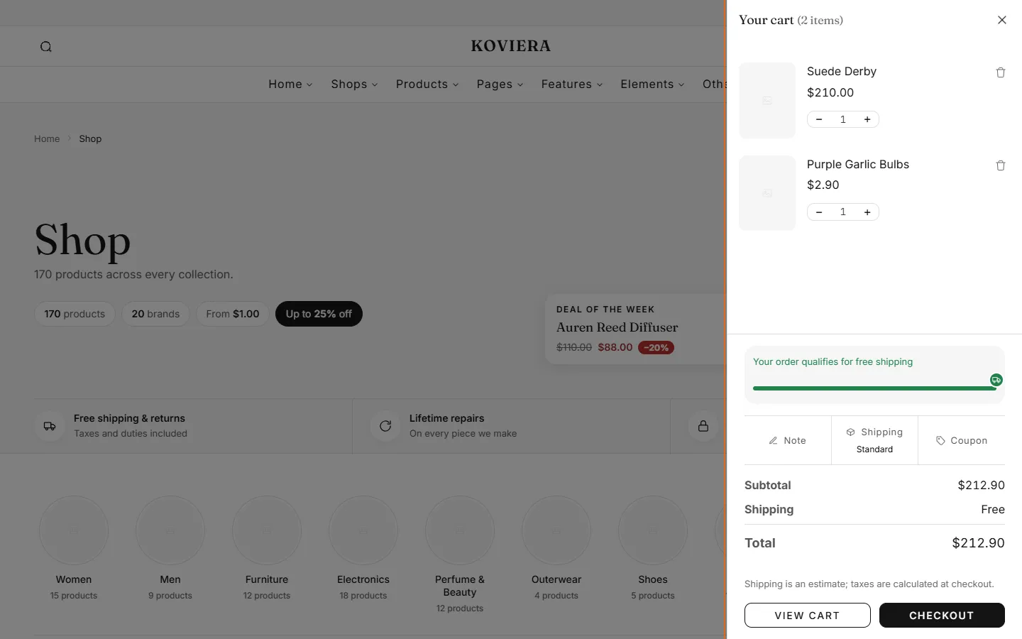
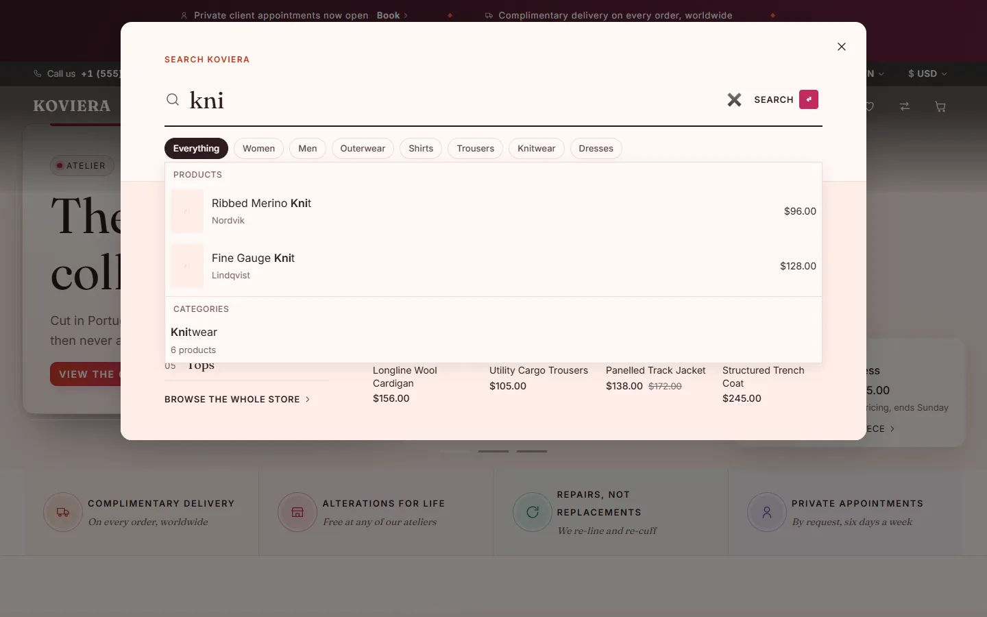
<button type="button" data-bs-toggle="offcanvas" data-bs-target="#vt-cart-drawer">Cart</button>The drawers every page carries: #vt-cart-drawer, #vt-search-drawer, #vt-mobile-nav.
Product actions
<button data-vt-action="add-to-cart"
        data-vt-product='{"id":1001,"name":"...","price":129,"image":"...","url":"..."}'>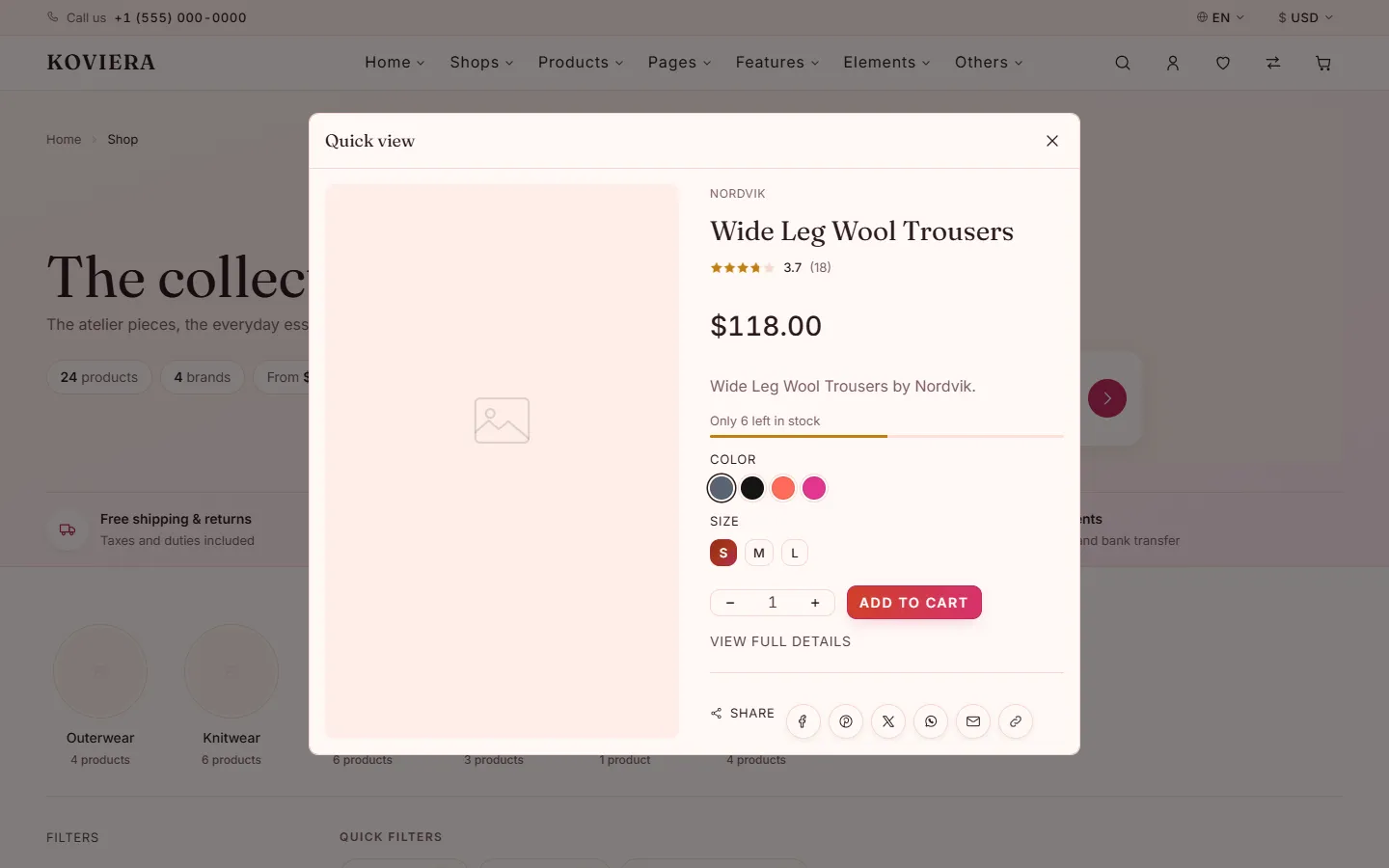
The button carries a snapshot of the product, exactly as a form post would, so nothing has to be fetched. buy-now, wishlist, compare and quick-view work the same way.
Recently viewed
A product page adds itself to the visitor's history from the element that scopes its buttons:
<div class="vt-pdp" data-vt-product-scope data-vt-product-id="1024">The recently-viewed section (on the cart page) then shows those products, newest first. It carries a hidden card for every product that has a page of its own and reveals the ones in the history. If you add product pages, add their products to the section; with a backend, render the visitor's own history instead.
Carousel autoplay
data-vt-options='{"autoplay":{"delay":5000,"disableOnInteraction":false}}'The options are Swiper's, but the timing is the carousel's own: one timeout per slide rather than Swiper's Autoplay module, which runs a callback on every animation frame for as long as the page is open. As in Swiper, a carousel stops for good once the visitor drags it, clicks an arrow or a dot, or uses the keys, unless disableOnInteraction is false. It pauses while the tab is hidden, and never starts for a visitor who asked for reduced motion.
Connecting a real backend
Cart, wishlist and compare go through one object, the data source. The one that ships keeps everything in the browser's localStorage (keys start vt:), so the demo works with no server.
To move them onto your own backend, open html/js/core/app.js and find setSource(staticSource). The shipped source is html/js/adapters/static-source.js. Replace staticSource with an object of your own that has the same methods, each returning a promise:
getProducts(query)   getProduct(id)       search(term)
getCart()            addToCart(id, qty, variation)
updateCartItem(key, qty)                  removeCartItem(key)
getWishlist()        toggleWishlist(product)   clearWishlist()
getCompare()         toggleCompare(product)    clearCompare()
compareLimit         (a number: how many products a comparison holds)
No component changes. If your pages link the minified files, run npm run build afterwards.
Heavy libraries
Swiper and GLightbox are linked only by the pages that use them — the carousels and the product gallery. If you add a carousel to a page that has none, add its library before the koviera:js block:
<script src="./js/libs/swiper.min.js" defer></script>and ./js/libs/glightbox.min.js plus ./css/libs/glightbox.min.css for a gallery that opens in a lightbox. A page that needs one and lacks it says so in the browser console.
Right to left
Two changes. Set the direction on <html>:
<html lang="ar" dir="rtl">and link Bootstrap's mirrored stylesheet instead of the standard one:
<link rel="stylesheet" href="assets/css/bootstrap.rtl.min.css" />There is no Koviera RTL stylesheet to add: the same files serve both directions.
Open html/rtl.html to see it: that page is the Fashion homepage with dir="rtl", the mirrored Bootstrap, and nothing else changed.
Why it works
Every Koviera rule uses CSS logical properties — margin-inline-start instead of margin-left, inset-inline-end instead of right, text-align: start instead of left. The browser mirrors them for you. Bootstrap is written with physical properties, which is why it ships its own mirrored build.
The exceptions
Transforms have no logical form, so the template uses a direction token:
:root      { --vt-dir:  1; }
[dir="rtl"]{ --vt-dir: -1; }

.vt-offcanvas--end .vt-offcanvas__panel {
  transform: translateX(calc(100% * var(--vt-dir)));
}
Use the same token if you add a component that slides or offsets.
Content
Latin text inside an RTL page will have its punctuation rendered on the opposite side. That is the browser applying bidi rules correctly, not a fault. Prices, phone numbers and times are already isolated so they stay left to right.
Minified build
Optional. The template needs nothing installed: every page links readable files, one per component, and works as it is. The build only makes smaller copies of them, for production.
Running it
Requires Node 20 or newer. From the folder that holds package.json:
npm install
npm run build          minified copies in html/dist/
npm run build:pages    also one stylesheet per page
npm run build:link     also points every page at the minified files
npm install fetches one package, esbuild. The readable files are never modified.
What it writes
| File | What it holds |
|---|---|
html/dist/css/koviera.min.css | Every stylesheet, in cascade order |
html/dist/js/koviera.min.js | Every script, in load order |
html/dist/css/**, html/dist/js/** | Each file minified on its own |
html/dist/css/pages/<page>.min.css | build:pages and build:link: only the stylesheets that page links |
html/dist/js/pages/<page>.min.js | build:pages and build:link: only the scripts that page links |
Third-party libraries — css/libs/, js/libs/ and Bootstrap in assets/css/ — are already minified and are left out of the bundles, so each can be updated on its own.
Switching the pages over
Each page marks the files the build replaces:
<!-- koviera:css -->
<link rel="stylesheet" href="./css/tokens/colors.css" />
...
<!-- /koviera:css -->

<!-- koviera:js -->
<script src="./js/core/registry.js" defer></script>
...
<!-- /koviera:js -->
npm run build:link replaces each block with one file:
<link rel="stylesheet" href="./dist/css/pages/home-fashion.min.css" />
<script src="./dist/js/pages/home-fashion.min.js" defer></script>
Warning
after that a page no longer reads css/ and js/, so keep a copy of html/ from before the link to go on editing.
Where the order comes from
- CSS — the
@importlist inhtml/css/main.css. A new stylesheet goes into that list, in its layer, and into thekoviera:cssblock of the pages that need it. - JS — each script registers itself on
window.KovieraModulesand reads the scripts it depends on from there; the build works out the order from those reads. A new script is picked up on its own; link it inside thekoviera:jsblock after the scripts it reads.
Credits and licensing
The short version
This template contains no photographic assets. Every image slot in this download renders a single placeholder file, assets/images/placeholder.svg, authored for this template.
The pictures visible on the live preview were generated for this demo with Leonardo.Ai and are served by the preview itself. They are not stored in this download and are not redistributed. Nothing in the package requests anything from an external server — it works with no network at all.
What ships in this download
| Asset | Origin | Licence | Licence text |
|---|---|---|---|
assets/images/placeholder.svg | Authored for this template | Covered by your item licence | — |
assets/images/brands/*.svg | Fictional wordmarks, authored for this template | Covered by your item licence | — |
assets/images/demos/*.webp, assets/images/demos/pages/*.webp | Screenshots of this template's own pages, placeholders only | Covered by your item licence | — |
assets/favicon.svg | Authored for this template | Covered by your item licence | — |
assets/fonts/inter-*.woff2 | Inter | SIL OFL 1.1 | assets/fonts/OFL-Inter.txt |
assets/fonts/fraunces-*.woff2 | Fraunces | SIL OFL 1.1 | assets/fonts/OFL-Fraunces.txt |
| Bootstrap 5 | getbootstrap.com | MIT | licenses/bootstrap-MIT.txt |
| Popper | popper.js.org, bundled with Bootstrap | MIT | licenses/popper-MIT.txt |
| Swiper | swiperjs.com | MIT | licenses/swiper-MIT.txt |
| GLightbox | biati-digital/glightbox | MIT | licenses/glightbox-MIT.txt |
| Hover and focus effects adapted from Uiverse | The authors listed in the licence file | MIT | licenses/uiverse-MIT.txt |
What does not ship
| Asset | Licence | Why it is not here |
|---|---|---|
| Preview imagery generated with Leonardo.Ai | Leonardo.Ai Terms of Service | Made on the free plan, whose generations are public and non-exclusive — they illustrate the demo and are not ours to hand on |
Preview imagery
270 pictures, all generated with Leonardo.Ai for this template, fill the image slots on the live preview. Several slots share one picture, so a product's alternate view or a category tile may repeat an image from the same storefront. They are listed so the provenance of every image can be checked directly.
| File | Shows | Made with |
|---|---|---|
bags_hero_1.jpg | leather holdall on a workbench among tanning tools | Leonardo.Ai |
bags_hero_2.jpg | leather weekender on a station bench beside the rails | Leonardo.Ai |
bags_hero_3.jpg | tan leather tote on a sunlit stone window seat | Leonardo.Ai |
electronic_hero_1.jpg | laptop and speakers on a desk lit by a warm lamp, in the dark | Leonardo.Ai |
electronic_hero_2.jpg | monitor, laptop and audio kit on a wooden desk | Leonardo.Ai |
electronic_hero_3.jpg | living room with a wall-mounted screen and low lighting | Leonardo.Ai |
electronic_hero_4.jpg | phone, earbuds and a speaker on a marble table in soft light | Leonardo.Ai |
fashion_hero_1.jpg | woman in a camel coat walking through a pale gallery | Leonardo.Ai |
fashion_hero_2.jpg | woman in a long coat walking across a courtyard | Leonardo.Ai |
fashion_hero_3.jpg | woman in a dark suit under a curved concrete canopy | Leonardo.Ai |
furniture_hero_1.jpg | living room with a curved sofa, low table and lounge chair | Leonardo.Ai |
jewellery_hero_1.jpg | gold rings and necklaces on a stone slab in morning light | Leonardo.Ai |
jewellery_hero_2.jpg | gold rings and a chain on marble, portrait | Leonardo.Ai |
organic_hero_1.jpg | harvest table of vegetables and bread by an open window | Leonardo.Ai |
organic_hero_2.jpg | kitchen counter heaped with fresh produce | Leonardo.Ai |
organic_hero_3.jpg | market stall of vegetables and greens | Leonardo.Ai |
perfume_hero_1.jpg | amber fragrance bottle on a cork plinth in warm light | Leonardo.Ai |
shoes_hero_1.jpg | white leather trainers on concrete steps | Leonardo.Ai |
shoes_hero_2.jpg | brown trail shoe on a rocky hillside at sunset | Leonardo.Ai |
toys_hero_bg.jpg | soft-focus pastel playroom wall, full-width hero background | Leonardo.Ai |
toys_hero_1.jpg | sunlit playroom with wooden toys on the floor | Leonardo.Ai |
watches_hero_1.jpg | steel field watch on a brown leather strap, on a rock | Leonardo.Ai |
product_oversized-cotton-jacket.jpg | young woman posing in white jacket | Leonardo.Ai |
product_relaxed-linen-shirt.jpg | woman wearing a relaxed oversized white linen shirt, sleeves loosely rolled | Leonardo.Ai |
product_wide-leg-wool-trousers.jpg | model in high-waisted wide-leg khaki wool trousers and a striped tee | Leonardo.Ai |
product_ribbed-merino-knit.jpg | close up showing detail of cream sweater | Leonardo.Ai |
product_silk-slip-dress.jpg | woman in an ivory silk slip dress with thin straps, fabric catching the light | Leonardo.Ai |
product_heavyweight-cotton-tee.jpg | man in a heavyweight plain white cotton t-shirt, boxy fit | Leonardo.Ai |
product_panelled-track-jacket.jpg | man in a panelled retro track jacket in navy and off-white | Leonardo.Ai |
product_utility-cargo-trousers.jpg | man in relaxed olive utility cargo trousers with a white shirt, cropped at the torso | Leonardo.Ai |
product_boxy-denim-overshirt.jpg | man in a boxy mid-blue denim overshirt over a white tee | Leonardo.Ai |
product_broderie-layer-top.jpg | white lace layered short sleeve top | Leonardo.Ai |
product_merino-roll-neck.jpg | black roll neck and dark trousers against brick | Leonardo.Ai |
product_structured-trench-coat.jpg | woman in a structured stone-beige double-breasted trench coat, belt tied | Leonardo.Ai |
product_saga-open-shelving.jpg | white open shelving unit holding plants and small objects | Leonardo.Ai |
product_lofoten-lounge-chair.jpg | soft pink cushioned armchair in stately salon | Leonardo.Ai |
product_fjord-oak-dining-table.jpg | solid light oak dining table set for two in a bright dining room | Leonardo.Ai |
product_bergen-bedside-table.jpg | small oak bedside table with a drawer next to a made bed, lamp and book on top | Leonardo.Ai |
product_skagen-floor-lamp.jpg | slim brushed-steel floor lamp with a soft linen shade beside a reading chair | Leonardo.Ai |
product_halden-modular-sofa.jpg | natural white sofa on wood frame | Leonardo.Ai |
product_nordvik-plank-table.jpg | reclaimed timber table and benches under a canopy | Leonardo.Ai |
product_stege-ladder-shelf.jpg | wooden ladder shelf stepped with potted plants | Leonardo.Ai |
product_voss-wool-rug.jpg | thick undyed grey-cream wool rug with subtle texture on an oak floor, close-up | Leonardo.Ai |
product_kvist-dining-chair.jpg | black dining chair drawn up to a round timber table | Leonardo.Ai |
product_halden-slipper-chair.jpg | cantilever chair with thick ochre cushions | Leonardo.Ai |
product_verk-workshop-shelf.jpg | timber shelving against a whitewashed wall | Leonardo.Ai |
product_halix-ultrabook-14.jpg | thin silver 14-inch ultrabook laptop half open on a desk beside a coffee cup | Leonardo.Ai |
product_voltra-flagship-5g.jpg | sleek black flagship smartphone held in hand, blurred city behind | Leonardo.Ai |
product_kaion-studio-headphones.jpg | black over-ear studio headphones, close-up of the cushioned cups | Leonardo.Ai |
product_voltra-tab-pro-11.jpg | an tablet and stylus laying on a white surface | Leonardo.Ai |
product_halix-precision-mouse.jpg | hand resting on a low-profile mouse and keyboard | Leonardo.Ai |
product_halix-studio-display.jpg | desk lit by a wide monitor in a dark room | Leonardo.Ai |
product_halix-creator-laptop-16.jpg | large 16-inch space-grey creator laptop seen from a low side angle | Leonardo.Ai |
product_voltra-pulse-5g.jpg | black phone photographed against a white ground | Leonardo.Ai |
product_kaion-air-buds.jpg | four earbud charging cases lined up on grey | Leonardo.Ai |
product_voltra-slate-11.jpg | tablet, phone and stylus on a pale desk | Leonardo.Ai |
product_voltra-pulse-pro.jpg | black phone with its screen lit, on white | Leonardo.Ai |
product_kaion-desk-mic.jpg | condenser microphone tilted over a keyboard | Leonardo.Ai |
product_auren-neroli-bloom.jpg | dramatic black glass perfume bottle with orange blossom petals around it | Leonardo.Ai |
product_velmont-silk-hand-cream.jpg | hand cream in a minimal beige tube, a swirl of cream on a fingertip, beige backdrop | Leonardo.Ai |
product_auren-discovery-set.jpg | set of small perfume sample vials in an open neutral box, hands holding one | Leonardo.Ai |
product_auren-wild-fig-cologne.jpg | antique mirror beside pearl earrings and a bottle of perfume | Leonardo.Ai |
product_auren-cedar-amber.jpg | amber glass perfume bottle on a vanity table, warm woody mood | Leonardo.Ai |
product_velmont-renewing-face-oil.jpg | water splashing over hot stones beside essential oil and green leaves | Leonardo.Ai |
product_auren-bathing-gift-box.jpg | bath salts, flowers and beauty products laid flat on marble | Leonardo.Ai |
product_auren-cedar-candle.jpg | white glass jar candle on a stool above a book | Leonardo.Ai |
product_velmont-botanical-body-oil.jpg | stones, flowers and bottles of natural oil arranged together | Leonardo.Ai |
product_auren-petal-gift-set.jpg | brushes and blossoms arranged as a flat lay | Leonardo.Ai |
product_auren-reed-diffuser.jpg | lit candles, handmade products and folded white towels | Leonardo.Ai |
product_velmont-ritual-set.jpg | assortment of beauty products laid out on a black table | Leonardo.Ai |
product_trail-runner-gtx.jpg | athlete tying the laces of grey and orange trail running shoes on a rocky path | Leonardo.Ai |
product_suede-derby.jpg | pair of tan suede derby shoes leaning against a white wall | Leonardo.Ai |
product_runner-low-sneaker.jpg | fashionable black and white sneakers | Leonardo.Ai |
product_chelsea-leather-boot.jpg | pair of brown leather Chelsea boots on a powder-blue ground | Leonardo.Ai |
product_court-classic.jpg | pair of white leather court sneakers against a wooden slat wall | Leonardo.Ai |
product_trunk-55.jpg | worn leather trunk photographed close up | Leonardo.Ai |
product_structured-leather-tote.jpg | structured navy leather tote handbag standing upright | Leonardo.Ai |
product_canvas-weekender.jpg | sand canvas weekender bag with leather handles and trims | Leonardo.Ai |
product_minimal-crossbody.jpg | light pink purse | Leonardo.Ai |
product_roll-top-backpack.jpg | black waxed roll-top backpack standing upright on concrete | Leonardo.Ai |
product_evening-clutch.jpg | light tan leather evening clutch with a slim metal clasp | Leonardo.Ai |
product_day-tote.jpg | black leather tote with two strap lengths | Leonardo.Ai |
product_leather-duffle-40.jpg | brown leather duffle carried in both hands | Leonardo.Ai |
product_grained-crossbody.jpg | small grained crossbody worn at the hip | Leonardo.Ai |
product_grained-zip-backpack.jpg | black backpack seen from the side | Leonardo.Ai |
product_rounded-shoulder-bag.jpg | rounded black leather shoulder bag | Leonardo.Ai |
product_cabin-trunk-45.jpg | tan leather suitcase standing against a wall | Leonardo.Ai |
product_chrono-sport.jpg | steel chronograph sport watch with a black dial and white subdials | Leonardo.Ai |
product_field-automatic-38.jpg | steel field watch with a white dial and leather strap | Leonardo.Ai |
product_diver-300.jpg | steel diver watch with a black rotating bezel on a leather strap among green leaves | Leonardo.Ai |
product_dress-slim-36.jpg | slim gold dress watch with a cream dial on a brown leather strap, on walnut wood | Leonardo.Ai |
product_halo-morganite-ring.jpg | rose gold halo ring with a large pink centre stone | Leonardo.Ai |
product_layered-bar-necklace.jpg | three fine gold chains with a bar pendant on marble | Leonardo.Ai |
product_baroque-pearl-studs.jpg | pearl stud earring worn with dark hair | Leonardo.Ai |
product_arrow-wrap-cuff.jpg | open gold cuff with an arrow on marble | Leonardo.Ai |
product_twin-stacking-rings.jpg | two rose gold rings stacked on linen | Leonardo.Ai |
product_turquoise-coin-necklace.jpg | layered gold chains with turquoise beads and coins on marble | Leonardo.Ai |
product_marble-stone-studs.jpg | white marbled stone studs on marble | Leonardo.Ai |
product_beaded-gold-bangle.jpg | beaded gold bangle on marble | Leonardo.Ai |
product_pave-eternity-band.jpg | gold stone-set band between two studs on a pastel ground | Leonardo.Ai |
product_amethyst-point-pendant.jpg | amethyst point pendant on a silver chain | Leonardo.Ai |
product_turquoise-drop-earrings.jpg | turquoise bead drop earrings on gold hooks | Leonardo.Ai |
product_stacked-bangle-trio.jpg | three stacked gold bangles with an arrow cuff | Leonardo.Ai |
product_rainbow-bell-peppers.jpg | red, orange, yellow and green peppers piled on a market stall | Leonardo.Ai |
product_hass-avocados.jpg | halved avocado with its stone on pale green | Leonardo.Ai |
product_cold-pressed-beet-juice.jpg | glass of beetroot juice in front of vegetables | Leonardo.Ai |
product_fresh-ginger-root.jpg | ginger root beside a small heap of ground ginger on black | Leonardo.Ai |
product_english-walnuts.jpg | walnuts and cracked shells in a small bowl on white | Leonardo.Ai |
product_apple-oat-bircher.jpg | jar of chopped apple over oats and yogurt beside whole apples | Leonardo.Ai |
product_yellow-bell-pepper.jpg | single pale yellow bell pepper on white | Leonardo.Ai |
product_green-seedless-grapes.jpg | hand holding up a bunch of green grapes | Leonardo.Ai |
product_oat-milk-cold-brew.jpg | iced milky coffee in a glass on a wooden table | Leonardo.Ai |
product_bird-s-eye-chillies.jpg | red chillies on the plant among green leaves | Leonardo.Ai |
product_cranberry-and-orange-mix.jpg | bowl of dried cranberries and orange pieces on a breakfast table | Leonardo.Ai |
product_golden-flax-seeds.jpg | bowl of flax seeds beside sliced bread | Leonardo.Ai |
product_stacking-bunny-tower.jpg | a wooden bunny ring stacker on a white shelf | Leonardo.Ai |
product_soft-foam-block-set.jpg | hands building with bright foam blocks | Leonardo.Ai |
product_classic-brown-teddy.jpg | a brown teddy bear sitting on a window ledge | Leonardo.Ai |
product_wooden-train-set.jpg | a wooden engine and carriages on a curved track | Leonardo.Ai |
product_gear-builder-set.jpg | bright interlocking toy gears on pink | Leonardo.Ai |
product_mosaic-1000-piece-puzzle.jpg | a heap of jigsaw pieces on a table | Leonardo.Ai |
product_donut-pool-ring.jpg | a pink sprinkled donut pool ring | Leonardo.Ai |
product_rainbow-caterpillar.jpg | a jointed wooden caterpillar in bright beads | Leonardo.Ai |
product_rainbow-arch-blocks.jpg | toddler hands among arches and cubes of foam | Leonardo.Ai |
product_shelf-friends-trio.jpg | three soft toys on a tree-shaped nursery shelf | Leonardo.Ai |
product_figure-eight-rail-track.jpg | a wooden figure-eight rail track from above | Leonardo.Ai |
product_hedgehog-peg-board.jpg | a wooden hedgehog peg board with fruit pieces | Leonardo.Ai |
cate_phones.jpg | white phone on a table | Leonardo.Ai |
banner_b-03.jpg | assorted shirts folded and stacked | Leonardo.Ai |
blog_b-03.jpg | a stack of sweaters on a wooden chair | Leonardo.Ai |
blog_b-01.jpg | a sweater hanging on a hook | Leonardo.Ai |
blog_b-02.jpg | white and brown knit textile | Leonardo.Ai |
blog_b-04.jpg | close-up of a sweater beside a plant | Leonardo.Ai |
blog_b-05.jpg | white and grey knit textile | Leonardo.Ai |
banner_b-02.jpg | assorted shirts on hangers | Leonardo.Ai |
banner_b-01.jpg | close-up of shirts hanging on a rack | Leonardo.Ai |
cate_men.jpg | man in a white shirt and black jacket against a plain wall | Leonardo.Ai |
banner_season-shop.jpg | brick fireplace lit in a furnished sitting room | Leonardo.Ai |
banner_furniture-workshop.jpg | maker planing a board at a workbench, shavings piled beside it | Leonardo.Ai |
banner_kids-room.jpg | patterned cushions stacked against cactus wallpaper | Leonardo.Ai |
banner_registry-table.jpg | table laid with white linen, glassware and flowers | Leonardo.Ai |
banner_jewelry-chains.jpg | a row of gold chains hanging against black | Leonardo.Ai |
banner_jewelry-display.jpg | fine necklaces hanging in a dark display | Leonardo.Ai |
banner_jewelry-workshop.jpg | jeweller's files and hammers laid out on wood | Leonardo.Ai |
banner_jewelry-atelier.jpg | loose gemstones, a loupe and tweezers from above | Leonardo.Ai |
banner_organic-veg.jpg | cabbage, broccoli, radishes and peppers on white | Leonardo.Ai |
banner_organic-pantry.jpg | chillies, sliced carrots and herbs in a corner of oak | Leonardo.Ai |
banner_organic-fruit.jpg | bowl of bananas, grapes and pomegranate on linen | Leonardo.Ai |
banner_organic-deal.jpg | chillies and sliced vegetables on oak | Leonardo.Ai |
banner_organic-field.jpg | carrots with green tops lying on dark soil | Leonardo.Ai |
banner_d-01.jpg | wooden ladder, stool and plant in a room | Leonardo.Ai |
cate_shoes.jpg | pair of brown leather boots | Leonardo.Ai |
product_toys-montessori.jpg | toddlers at a table of wooden learning toys | Leonardo.Ai |
banner_watches-workshop.jpg | watchmaker in a loupe working on a movement in its holder | Leonardo.Ai |
banner_watches-movement.jpg | black and white macro of a watch movement before a service | Leonardo.Ai |
banner_watches-straps.jpg | six rubber watch straps with steel buckles, laid in a row | Leonardo.Ai |
cate_networking.jpg | patch panel with rows of network cables | Leonardo.Ai |
cate_cables.jpg | orange patch leads plugged into a switch | Leonardo.Ai |
cate_servers.jpg | close-up of a labelled patch panel | Leonardo.Ai |
cate_security.jpg | security camera mounted on a patterned facade | Leonardo.Ai |
cate_kitchen.jpg | espresso machine on a stone kitchen counter | Leonardo.Ai |
cate_personal-care.jpg | row of electric toothbrushes against orange | Leonardo.Ai |
cate_gaming.jpg | gaming mouse and glasses on a laptop | Leonardo.Ai |
hero_bags.jpg | tan leather satchel resting on a made bed | Leonardo.Ai |
hero_laptop.jpg | open laptop alone on a black desk in a bare room | Leonardo.Ai |
hero_fashion-luxury.jpg | tweed coat on a tailor's dress form | Leonardo.Ai |
hero_streetwear-2.jpg | lone figure walking past a pink and white wall | Leonardo.Ai |
hero_streetwear-3.jpg | model in navy silk against a dark studio ground | Leonardo.Ai |
hero_shoes.jpg | navy suede boots against a yellow textured floor | Leonardo.Ai |
hero_shoes-2.jpg | wooden shoe lasts hung in rows on a wall | Leonardo.Ai |
hero_toys-alt.jpg | a child hopping across a chalked hopscotch grid | Leonardo.Ai |
hero_watches.jpg | plain-dialled wristwatch on slatted wood, under hard shadow | Leonardo.Ai |
product_poplin-overshirt.jpg | Poplin Overshirt | Leonardo.Ai |
product_oxford-shirt.jpg | Oxford Shirt | Leonardo.Ai |
product_embroidered-sleeve-blouse.jpg | Embroidered Sleeve Blouse | Leonardo.Ai |
product_cutwork-sleeve-top.jpg | Cutwork Sleeve Top | Leonardo.Ai |
product_cashmere-crew-neck.jpg | Cashmere Crew Neck | Leonardo.Ai |
product_longline-wool-cardigan.jpg | Longline Wool Cardigan | Leonardo.Ai |
product_brushed-roll-neck.jpg | Brushed Roll Neck | Leonardo.Ai |
product_high-rise-denim.jpg | High Rise Denim | Leonardo.Ai |
product_brushed-flannel-shirt.jpg | Brushed Flannel Shirt | Leonardo.Ai |
product_boxy-jersey-tee.jpg | Boxy Jersey Tee | Leonardo.Ai |
product_fine-gauge-knit.jpg | Fine Gauge Knit | Leonardo.Ai |
product_unstructured-blazer.jpg | Unstructured Blazer | Leonardo.Ai |
product_unstructured-blazer-2.jpg | Unstructured Blazer, alternate view | Leonardo.Ai |
product_unstructured-blazer-3.jpg | Unstructured Blazer, alternate view | Leonardo.Ai |
product_unstructured-blazer-4.jpg | Unstructured Blazer, alternate view | Leonardo.Ai |
product_saga-open-shelving-2.jpg | Saga Open Shelving, alternate view | Leonardo.Ai |
product_saga-open-shelving-3.jpg | Saga Open Shelving, alternate view | Leonardo.Ai |
product_saga-open-shelving-4.jpg | Saga Open Shelving, alternate view | Leonardo.Ai |
product_halix-ultrabook-14-2.jpg | Halix Ultrabook 14, alternate view | Leonardo.Ai |
product_halix-ultrabook-14-3.jpg | Halix Ultrabook 14, alternate view | Leonardo.Ai |
product_halix-ultrabook-14-4.jpg | Halix Ultrabook 14, alternate view | Leonardo.Ai |
product_kaion-shelf-speaker.jpg | Kaion Shelf Speaker | Leonardo.Ai |
product_kaion-wireless-earbuds.jpg | Kaion Wireless Earbuds | Leonardo.Ai |
product_velmont-renewing-face-oil-2.jpg | Velmont Renewing Face Oil, alternate view | Leonardo.Ai |
product_velmont-renewing-face-oil-3.jpg | Velmont Renewing Face Oil, alternate view | Leonardo.Ai |
product_velmont-renewing-face-oil-4.jpg | Velmont Renewing Face Oil, alternate view | Leonardo.Ai |
product_chelsea-leather-boot-2.jpg | Chelsea Leather Boot, alternate view | Leonardo.Ai |
product_chelsea-leather-boot-3.jpg | Chelsea Leather Boot, alternate view | Leonardo.Ai |
product_chelsea-leather-boot-4.jpg | Chelsea Leather Boot, alternate view | Leonardo.Ai |
product_diver-300-2.jpg | Diver 300, alternate view | Leonardo.Ai |
product_diver-300-3.jpg | Diver 300, alternate view | Leonardo.Ai |
product_diver-300-4.jpg | Diver 300, alternate view | Leonardo.Ai |
product_grained-flap-bag.jpg | Grained Flap Bag | Leonardo.Ai |
product_chain-mini-bag.jpg | Chain Mini Bag | Leonardo.Ai |
product_card-crossbody.jpg | Card Crossbody | Leonardo.Ai |
product_everyday-backpack.jpg | Everyday Backpack | Leonardo.Ai |
product_flap-backpack.jpg | Flap Backpack | Leonardo.Ai |
product_flap-backpack-2.jpg | Flap Backpack, alternate view | Leonardo.Ai |
product_flap-backpack-3.jpg | Flap Backpack, alternate view | Leonardo.Ai |
product_flap-backpack-4.jpg | Flap Backpack, alternate view | Leonardo.Ai |
product_weekend-duffle.jpg | Weekend Duffle | Leonardo.Ai |
product_voltra-edge-compact.jpg | Voltra Edge Compact | Leonardo.Ai |
product_kaion-nova.jpg | Kaion Nova | Leonardo.Ai |
product_kaion-nova-2.jpg | Kaion Nova, alternate view | Leonardo.Ai |
product_kaion-nova-3.jpg | Kaion Nova, alternate view | Leonardo.Ai |
product_kaion-nova-4.jpg | Kaion Nova, alternate view | Leonardo.Ai |
product_kaion-nova-lite.jpg | Kaion Nova Lite | Leonardo.Ai |
product_kaion-canvas-11.jpg | Kaion Canvas 11 | Leonardo.Ai |
product_bunched-garden-carrots.jpg | Bunched Garden Carrots | Leonardo.Ai |
product_heirloom-rainbow-carrots.jpg | Heirloom Rainbow Carrots | Leonardo.Ai |
product_tenderstem-broccoli.jpg | Tenderstem Broccoli | Leonardo.Ai |
product_green-asparagus-bunch.jpg | Green Asparagus Bunch | Leonardo.Ai |
product_vine-ripened-tomatoes.jpg | Vine Ripened Tomatoes | Leonardo.Ai |
product_mixed-salad-leaves.jpg | Mixed Salad Leaves | Leonardo.Ai |
product_asparagus-tips.jpg | Asparagus Tips | Leonardo.Ai |
product_red-globe-grapes.jpg | Red Globe Grapes | Leonardo.Ai |
product_navel-oranges.jpg | Navel Oranges | Leonardo.Ai |
product_citrus-harvest-box.jpg | Citrus Harvest Box | Leonardo.Ai |
product_gala-apples.jpg | Gala Apples | Leonardo.Ai |
product_wild-blueberries.jpg | Wild Blueberries | Leonardo.Ai |
product_fresh-raspberries.jpg | Fresh Raspberries | Leonardo.Ai |
product_seedless-watermelon.jpg | Seedless Watermelon | Leonardo.Ai |
product_persian-limes.jpg | Persian Limes | Leonardo.Ai |
product_sunrise-papaya.jpg | Sunrise Papaya | Leonardo.Ai |
product_lemon-ginger-tonic.jpg | Lemon Ginger Tonic | Leonardo.Ai |
product_purple-garlic-bulbs.jpg | Purple Garlic Bulbs | Leonardo.Ai |
product_golden-flax-seeds-2.jpg | Golden Flax Seeds, alternate view | Leonardo.Ai |
product_golden-flax-seeds-3.jpg | Golden Flax Seeds, alternate view | Leonardo.Ai |
product_golden-flax-seeds-4.jpg | Golden Flax Seeds, alternate view | Leonardo.Ai |
product_wholegrain-cereal-hoops.jpg | Wholegrain Cereal Hoops | Leonardo.Ai |
product_pave-eternity-band-2.jpg | Pave Eternity Band, alternate view | Leonardo.Ai |
product_pave-eternity-band-3.jpg | Pave Eternity Band, alternate view | Leonardo.Ai |
product_pave-eternity-band-4.jpg | Pave Eternity Band, alternate view | Leonardo.Ai |
product_silver-eternity-band.jpg | Silver Eternity Band | Leonardo.Ai |
product_classic-wedding-band-pair.jpg | Classic Wedding Band Pair | Leonardo.Ai |
product_aqua-crystal-pendant.jpg | Aqua Crystal Pendant | Leonardo.Ai |
product_dove-chain-necklace.jpg | Dove Chain Necklace | Leonardo.Ai |
product_love-knot-stud-set.jpg | Love Knot Stud Set | Leonardo.Ai |
product_swallow-studs.jpg | Swallow Studs | Leonardo.Ai |
product_tassel-charm-bangle.jpg | Tassel Charm Bangle | Leonardo.Ai |
product_anchor-chain-bracelet.jpg | Anchor Chain Bracelet | Leonardo.Ai |
product_wiggle-worm-pull-along.jpg | Wiggle Worm Pull-Along | Leonardo.Ai |
product_wiggle-worm-pull-along-2.jpg | Wiggle Worm Pull-Along, alternate view | Leonardo.Ai |
product_wiggle-worm-pull-along-3.jpg | Wiggle Worm Pull-Along, alternate view | Leonardo.Ai |
product_wiggle-worm-pull-along-4.jpg | Wiggle Worm Pull-Along, alternate view | Leonardo.Ai |
product_alphabet-letter-blocks.jpg | Alphabet Letter Blocks | Leonardo.Ai |
product_playroom-block-bucket.jpg | Playroom Block Bucket | Leonardo.Ai |
product_big-hug-teddy.jpg | Big Hug Teddy | Leonardo.Ai |
product_holiday-teddy-gift-box.jpg | Holiday Teddy Gift Box | Leonardo.Ai |
product_tip-up-truck-duo.jpg | Tip-Up Truck Duo | Leonardo.Ai |
product_little-doctor-play-kit.jpg | Little Doctor Play Kit | Leonardo.Ai |
product_wind-up-tin-robot.jpg | Wind-Up Tin Robot | Leonardo.Ai |
product_family-bingo-night.jpg | Family Bingo Night | Leonardo.Ai |
product_dice-quest-board-game.jpg | Dice Quest Board Game | Leonardo.Ai |
product_tumble-tower.jpg | Tumble Tower | Leonardo.Ai |
product_pool-party-float-pack.jpg | Pool Party Float Pack | Leonardo.Ai |
product_red-bath-pool-boat.jpg | Red Bath & Pool Boat | Leonardo.Ai |
product_foldover-crossbody.jpg | Foldover Crossbody | Leonardo.Ai |
Replacing the imagery
Put your own files in html/assets/images/, point each <img> at them and drop its vt-image--placeholder class. On a product card, change "image" in the buttons' data-vt-product as well, so the cart and the wishlist show the same picture. SETUP.txt §5 walks through it.